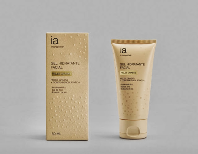
Designed by Eduardo Del Fraile, Spain.
The graphic solution for Interapothek is inspired on the expression “to get to the point” (or “to the spot”, as we say in Spanish): the package shows a vivid representation of the problem and of its remedy. Embossed spots cover the package, except where the name of the product has whipped them off. The cardboard chosen has a touch and a colour very similar to human skin. On the tube, instead, the spots have a shiny finishing as a sign of an oily skin. These simple effects elicit an instant reaction on behalf of the user, who recognizes and understands the message.
As Eduardo explains: ‘Acne is a very frustrating problem for adolescents as well as for grown up people. This brand offers a complete solution for the prevention and care of acne, thanks to a high-end pharmaceutical formula.’