Designer: Costas Polatoglou
Project Type: Commercial Work
Client: Kumilio P.C.
Location: Athens, Greece
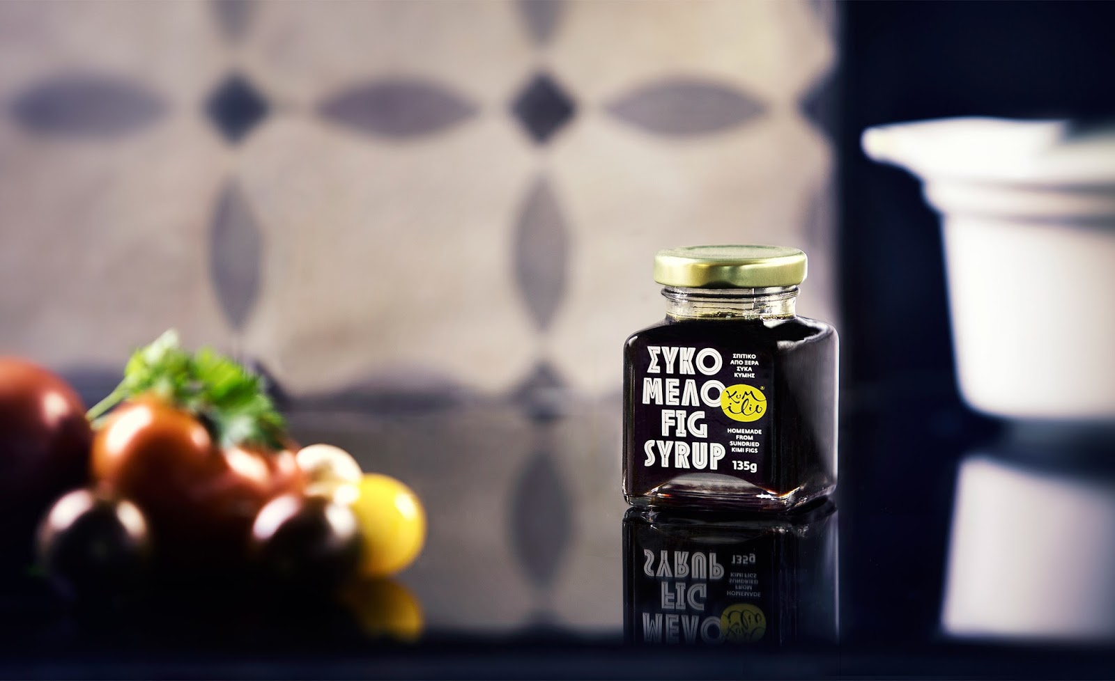
Naming, logo design, branding and packaging for Kumilio, a Greek company producing Kimi figs, established in 2015. Except for Kimi figs the company offers a series of products all having the Kimi fig as their main ingredient: fig marmalades, fig bars and fig syrup.
The identity is playful, using mosaic-styled illustrations, with the tesserae symbolizing the figs as they are put together on drying racks before they are let sun dry. The naive outlines give a carefree feeling that is contrasted by the strict typography met throughout the product range as well as the corporate identity, helping create a strong and memorable image.
Kumilio as a brand name, is actually a pun made of the words “kimilio” (meaning “heirloom” in Greek) and Kumi – as the locals call their hometown, Kimi.
The logo is attempting to give a simplified symbol for “heirloom”: an object of unclear use that usually derives its value from the intervention of the prior owner (probably a loved one), eg. inscription of their initials or full name.
A calligraphic approach was chosen in order to emphasize the uniqueness of such an item.