Design: Mara Rodríguez
Project Type: Produced, Commercial Work
Client: TOA Beverages
Location: Gijón, Asturias
Packaging Contents: Antioxidant drink
Packaging Substrate / Materials: Plastic
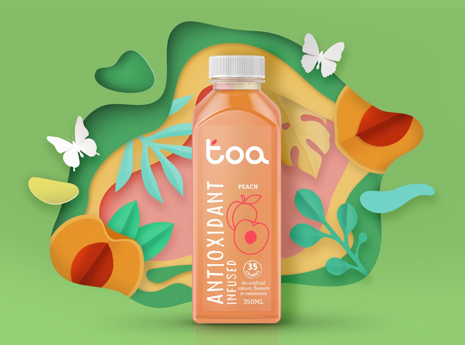
TOA’s branding and packaging design, a new Australian brand of antioxidant drinks based on fruit.
The word TOA comes from Maori which means fighter, which represents the ability of this antioxidant drink to fight against oxidation the body and free radicals.
Thus, the aim of the design is to clearly and easily convey the benefits of this product so that we base all the creativity on the main value of the brand: honesty. That is why we decided to play with the color of the drink itself as a fundamental element of design, and this will helps us to differentiate one flavor from another, and make the range colorful. Also, we will be able to play with transparencies, using as little ink as possible and using only white color and a different Pantone for each flavor.
For the graphics, we try to use the less elements as possible:
- The logo of the brand. This is created from 3 circles that form the 3 letters of TOA, accompanied only by a small sheet that gives the logo the natural and organic value.
- The description of the product: ANTIOXIDANT INFUSED, occupying the largest surface in the verticality of the label so that it is very visible in the supermarket since it’s the differential value of this beverage and the purchase ratio.
- The name of the flavor, which will be the third element in the reading order. It is accompanied by a line illustration, made as simplify as posible, which helps the consumer to quickly distinguish one product from another. In this illustration we will use a Pantone that contrasts with the background color and that makes our retinas vibrate, transmitting the freshness of TOA.
- Finally, at the top of the bottle we will find other necessary elements on the label, such as calories or benefits of the product, whose information is very important when making the purchase of this type of beverage.
Thus, together we have a minimalist and linear design, which manages to convey the freshness of a drink made mainly with fruit and that will stand out in the linear compared to other soft drinks whose design is usually more charged and saturated.