Design: Milk Brand Agency
Creative Director: Ben Reid
Design Director: Sarah Melrose
Designers: Laura Currie & Jeannie Burnside
Project Type: Produced, Commercial Work
Client: Hanleys
Location: New Zealand
Packaging Contents: Dog food
BACKGROUND
Hanleys make natural dog food, backed by science and enriched with amino acids, vitamins and minerals. It’s an ethical business founded by Philippa Hanley, a genuine animal lover who also has a background in dairy science and equine nutrition.With a personal passion for natural foods herself, Philippa knows that a lot of issues that animals are treated for at the vets can be corrected with diet. Unfortunately, like doctors, vets are often influenced by ‘the big guys’ in pet food – not always the best solution.
With this in mind, Hanleys asked us to create a brand that reflected their honest and natural passion for animals and nutrition.
APPROACH
Hanleys have a simple approach for decision-making within the business. They ask themselves: ‘What’s best for the animal?’We extended this approach to our task, creating a proposition of ‘Doing the absolute best for your animal’ – through diet, owners can see a visible difference in the appearance, energy and performance of their animals, sometimes within days.
Our proposition was supported by our brand values:
- The lightest touch – Ingredients as close as they can be to what dogs should be eating.
- Smaller is better – feed them less, feed them best.
- Know your sources – reliable and trustworthy food sources that reflect integrity.
- Put each animal first – what’s best for the animal.
- Act with love -celebrate the bond between people and animals.
We also knew that:
- People consider their animals to be part of the family
- Trusted advice is the most important driver of choice
- Pet food trends follow human trends

EXECUTION
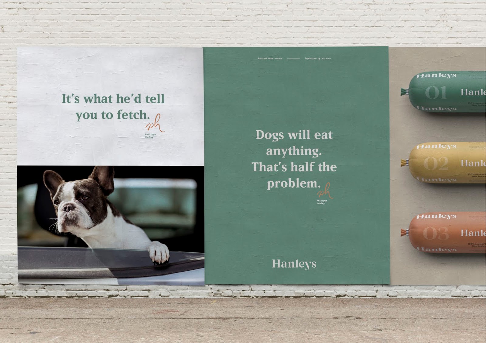
Hanley’s is a brand built on values, a completely genuine story about an owner and her love for animals and their wellbeing. Our identity needed to reflect this natural simplicity.Thus we chose natural raw photography showcasing animals in their everyday surroundings, doing things that dogs like to do. Colours, photography style and raw paper stocks represented where Hanleys is from – the South Island of New Zealand. We also showcased raw ingredients, natural and untouched, and built a community that showcased the farmers and growers of our natural ingredients, so owners could see the source.
Our packaging is simple, naïve, one colour and wholesome. Quite whimsical and anti-marketing, with a repeat pattern. Our wordmark also reflected this simplicity, echoing the kind of signage one might see stencilled around the farm. Philippa’s signature added a mark of authenticity.
And because dogs are a key member of the family, our identity was designed to make the dog food feel good enough for human consumption. A natural choice for man’s best friend.