Design: Anthem
Creative Director: Spencer Ball
Project Type: Produced, Commercial Work
Client: RedMart Singapore
Location: Singapore
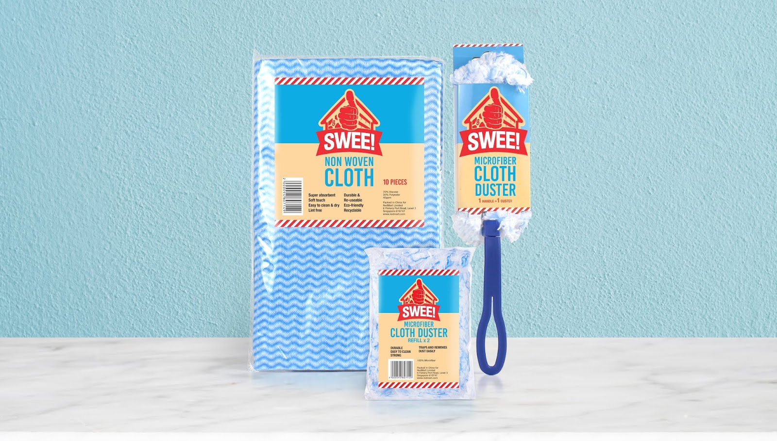
Packaging Contents: Soya Sauce, Sausages, Ham, Coffee, Scouring Pads
Packaging Substrate / Materials: Polythene, Paper
Printing Process: Flexo
Basic, good value packaging does not have to look cheap when there is a great story to tell!
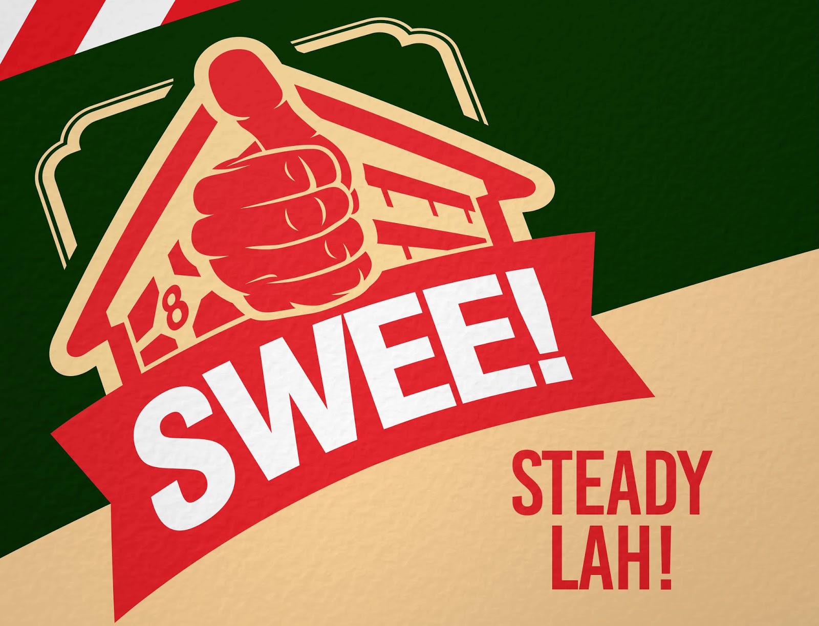
Swee! is a brand of everyday basics by RedMart, Singapore’s premier online grocer. The brief was to create a new brand for value-seeking shoppers, for a range of simple, no-frills products from Soy Sauce to 3-in-1 Coffee and Kitchen Sponges.
The Anthem design team drew inspiration from Singapore’s heartland, the utilitarian aesthetics of high-rise housing estates and the atmosphere of neighbourhood wet markets. So the pack design exudes a pragmatic but cheerful personality, to bring a bit of happiness to even the most simple product. The Swee! logo comprises a Singapore HDB block, with a straight-forward thumbs-up. The labels also include thoughtful design motifs created by Singapore’s pioneer architects in public housing projects. Anthem also coined the brand name ‘Swee!’ – a Singlish expression that roughly translates as ‘Works Perfectly!’
The range is sold exclusively on RedMart.com, so on-screen presence was the primary consideration for the pack design.
What’s Unique?
Very simply – it’s a uniquely Singaporean brand for a uniquely Singaporean shopper.