

Design: Chase Design Group
Location: United States
Project Type: Produced
Client: Morton Salt
Product Launch Location: United States
Packaging Contents: Culinary and home care
Morton Salt, one of America’s favorite and most enduring brands, has debuted a fresh new look on packaging to bring more flavor to its entire line-up of retail products. The eye-catchingly bold and contemporary design refreshes the iconic brand that consumers have known and loved for generations, while making its products more shoppable in today’s dynamic digital and in-store environment.
“Morton Salt has been part of hearts and homes all across America for more than a century,” said Denise Lauer, Chief Marketing Officer, Morton Salt, Inc. “As we continue to expand our brand and product portfolio, it is imperative to evolve our packaging for the future with more modern cues and a design system that helps consumers understand the variety, benefits, and versatility we have to offer across our culinary and home care categories.”
Morton partnered with creative agency, Chase Design Group, to develop a premium visual design that showcases brand colors, striking geometric angles and sans serif type to help make the packaging easier for consumers to navigate on shelf. The design system is anchored by the beloved Morton Salt Girl and a quality seal that highlights the company’s origins, which date back to 1848. In addition, Morton’s new packaging graphics feature more educational content about salt usage and carry the “How 2 Recycle” label to help consumers properly recycle its packaging.
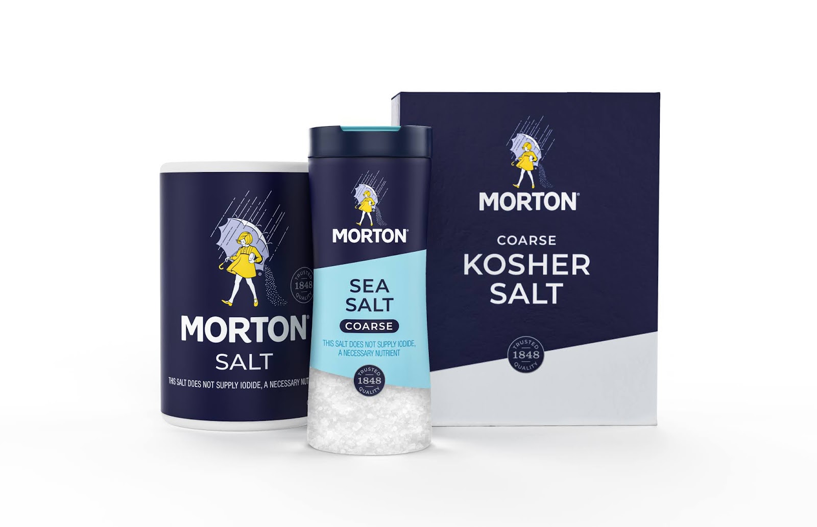
The stylish new design stretches across Morton’s entire retail portfolio, spanning both culinary and home care products—from Morton® Kosher Salt, Sea Salt and Himalayan Pink Salt to Morton® Water Softener Salt, Pool Salt, Ice Melt products and more.
Lauer added: “We’re taking a bold step into the future to enhance the experience for millions of consumers who turn to Morton Salt to flavor food, improve water quality and make life better. Rooted in extensive research and insights, we believe our new packaging design better reflects the needs of today’s consumers, while reinforcing our brand strength and heritage across the full portfolio of Morton products.”
“We successfully combined Morton’s iconic brand assets with clean typography and bold graphic shapes to create a design system that celebrates Morton’s rich history while feeling relevant to today’s consumers,” said Clark Goolsby, Chief Creative Officer, Chase Design Group, New York.
For Morton’s comprehensive line of culinary salts, it was important to create a design system that would clearly communicate the differences between product offerings. “This was achieved with a mix of interchangeable elements including transparent windows, usage occasion photography, color coding, iconography and typography,” he adds. For its home care line, the Morton brand was given greater prominence while design elements were simplified across the full range of packaging structures.

