Design: Rafael Cardoso
Location: Brazil
Project Type: Concept
Packaging Contents: Skincare
Packaging Substrate / Materials: Paper and Plastic
Printing Process: Offset printing
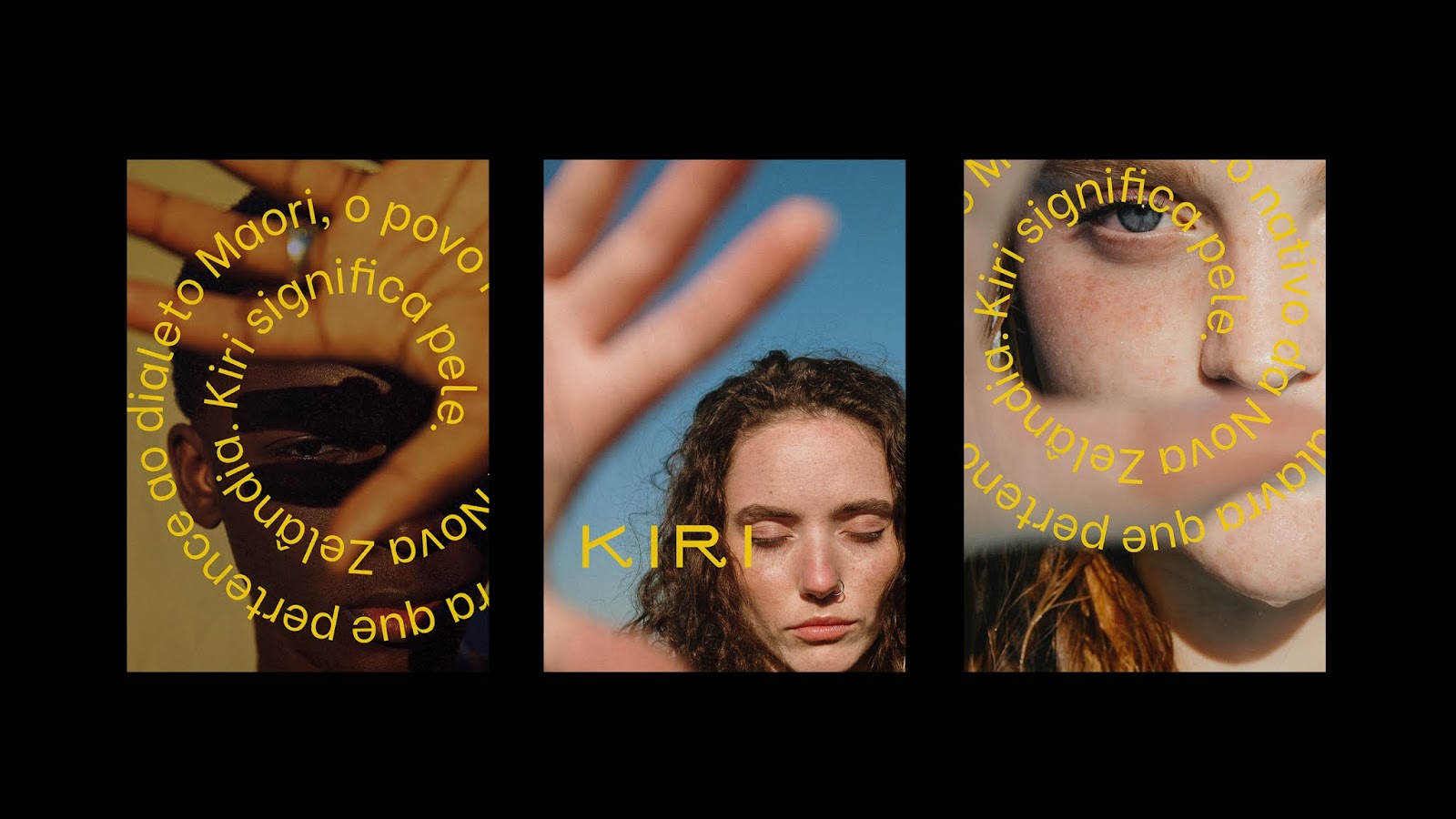
Kiri is a cosmetics brand from Brazil. The brand is focused on sunscreens, Kiri means SKIN in the Maori dialect, the native people of New Zealand. The construction of the logo typography was inspired by the spirals of the Koru, the sprout of the fern and the letters of the new Maori alphabet. Koru represents new life, growth, rebirth and a great connection to Earth. The packages were developed to represent the three layers of the skin; the outermost layer produced on cardboard, represents the epidermis; the packaging in shades of green, blue and yellow, represent the dermis; and the sunscreen tube represents the hypodermis, the deepest layer of the skin.
What’s Unique?
The work uses cardboard in 3 different colors, to represent different skintones. The combination of the concepts composes the contemporary and striking style of the brand.