
Designed by Lumium Innovations, India.
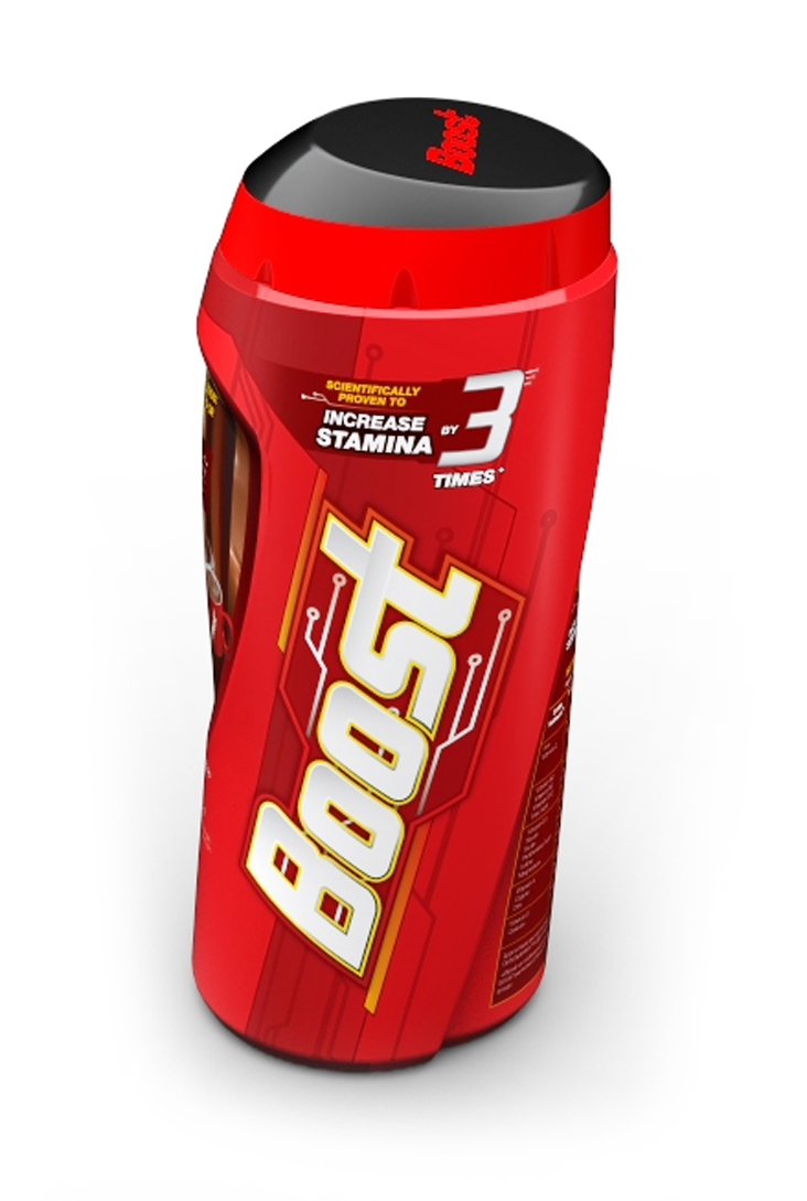
The new BOOST design stems from the very idea of connoting the brand attributes of physical energy & stamina. The idea is for the brand to be seen as new-age and masculine. It inspires a winning performance which is backed by cutting edge science and a proven pinnacle claim of ’3 times increase in stamina’ and also helps achieve a competitive status in all areas like school, sports and extra-curricular activities.
The brand language takes a crisp, modern and contemporary approach, appealing to the new-age urban kids and mothers alike. The asymmetric structure design also takes the elements like shield and boomerang to reflect the idea of science and protection coming together.
For designing the identity, the concept of an electric circuit takes shape as a visual representation of sustained energy and its movement through the body. The new BOOST logo combines dynamism and a cutting edge feel to it in line with the jar form and overall brand attributes. A custom typeface that is modern and muscular, young and energetic through its own unique set of elements.

 |
| Packaging before redesign |