Designers: Eve Warren and Thomas Squire
School: Leeds College Of Art
Country: United Kingdom
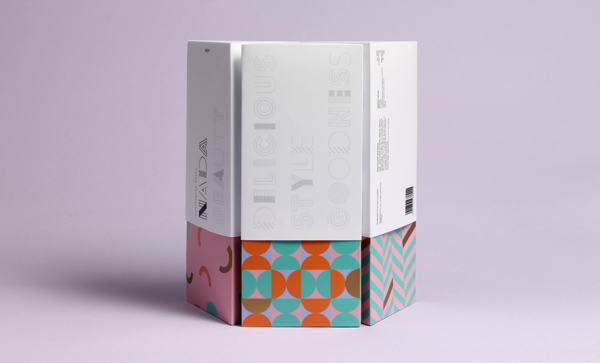
Nada isn’t just a brand for healthy food, but a brand that communicates through fashion, beauty, well being and body confidence. These core values reflect across the brands packaging and visual identity, through the use of minimalism contrasting with an array of bright and geometrical patterns. Minimalism has been applied to the lid of the packaging, which represent the products value of innocence, health and well being. The patterns that have been applied to the container symbolises fashion, beauty, the fusion of flavours and various pasta / noodle shapes. The gold foil adds luxury.
The Nada brand is an adaptive and flexible identity which is built upon a bespoke typeface which instills and encompasses our brand aesthetic and brand manifesto. The typography consists of 8 individual typefaces which when used dynamically build an adaptive brand identity. The logo mark has a static variant, this acts as the primary logo mark. However the brand is built upon the logo changing across products ranges and product types.