Design: Rhea Shah
Project Type: Student Project
School: Northumbria University School Of Design
Course: Branding and Identity
Tutor: Andy Reay, Mike Pinkney, Dave Gardener
Location: Newcastle Upon Tyne
Packaging Contents: Natural Energy Drink
Packaging Substrate / Materials: Aluminium Can
Printing Process: Digital Printing
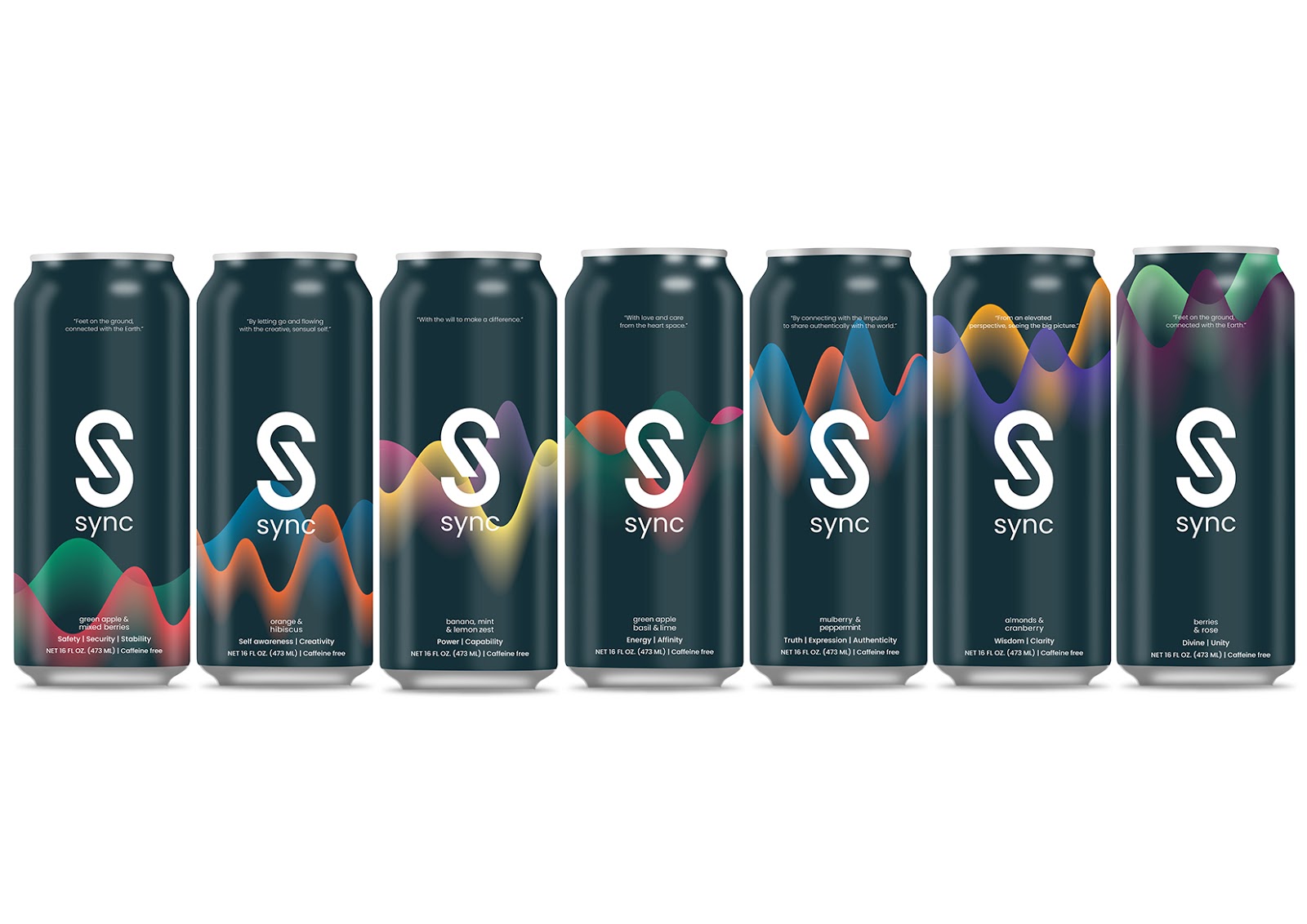
Just how everything is connected, our lives also move in a cyclical interconnected pattern corresponding to the seven chakras, A chakra is an energy centre that exists on the physiological level and runs from the spine all the way up to the crown of the head. The word ‘chakra’ literally translates to wheel.’ These chakras work in congruency with our lives. When the chakras are overactive, under-active or blocked it affects the body both physically and emotionally. It’s during this time in a middle-aged man’s life when he questions the life path he is on, and begins to fear the unknown or his mortality, often known as the famous ‘midlife crisis.’ Often meaning he has a block in the crown chakra.
Thus, Sync decided to do something about this and bring out a brand new line of beverages. Sync, a Natural Energy Drink specifically made for men going through midlife crisis. Since people at this crucial fork question life and search for spiritual connections we decided to implement the 7 chakras in our body to this phase. We handpicked the finest ingredients and made sure these herbs help liberate your tastebuds as well as speed up your recovery through the midlife malaise.
The brand identity and packaging has been devised keeping the brand values and personality in mind, while also making sure it integrates with the brand story. There are seven flavours which will help you balance your chakras and promise you a healthy and better life style.

What’s Unique?
The unique thing about this is it’s labelling. As you can see the waves keep ascending, this has a meaning behind it. Each chakra in your body has a frequency. These waves depict the frequency of that particular chakra in the body. We have decided to keep it Matt textured so that the waves are paid more attention to it and the surface doesn’t bounce the colours off.Also the packaging it classy and elite since no other energy drink sells it this way. The normal packaging that are to be sold in retail stores aren’t cuboids. It is in the shape of a trapezoid since there are seven flavours.
It sets itself apart from any other energy drink you’ve ever seen.