

Agency: étiquette
Head of marketing: Ieva Čepononė
Brand manager: Indrė Urbienė
Design strategy, Art direction: Valerija Žilėnienė
Art direction, Graphic design: Gabija Platūkytė
Art direction, Graphic design: Aliona Bobin
Prepress design: Žymantas Abromaitis
Account management: Estera Tamošaitytė, Rita Dargytė
Product photo shoot: Packshot studio
Project Type: Produced, Commercial Work
Client: Biok laboratorija
Location: Lithuania
Packaging Contents: Cosmetics
Packaging Substrate / Materials: Paper, Cardboard, Plastic, Plastic bottles
Printing Process: Flexography
SITUATION
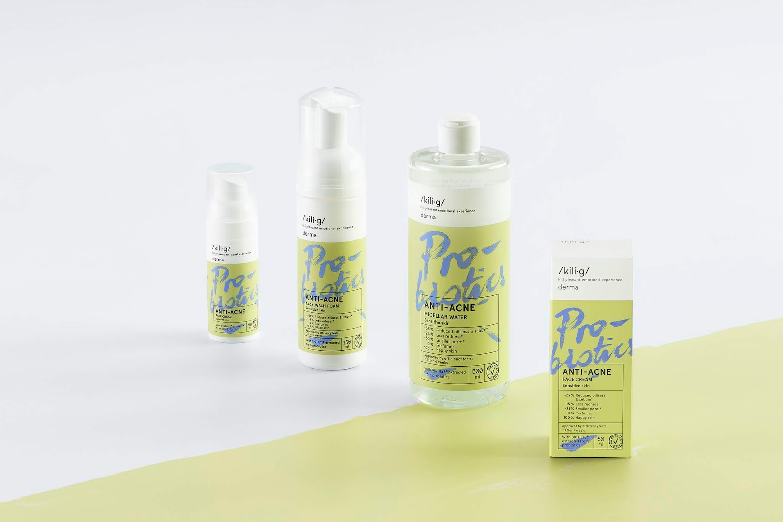
BIOK Laboratorija has been developing natural, innovative beauty and personal care products for almost 30 years. Today, it’s the largest and fastest-growing manufacturer of cosmetics in Lithuania.After achieving the set goals in Lithuania, the company has a vision to become recognisable globally. A brave step into the worldwide market requires bold solutions, of course. BIOK Laboratorija has decided to unite its three brands of cosmetics for separate consumer groups and create a single, new, umbrella brand called /kili•g/.
Kilig is a new word that’s included in the Oxford English dictionary. It originates from the Filipino language, and refers to a pleasant emotional experience – butterflies in one’s stomach.
TASK
The challenge for the agency was to come up with an unconventional identity for a mainstream brand. The actual task was to create the logo, develop an identity, a design concept, and packaging design for different lines of products for several users groups. Visual solutions had to reflect the values of the brand, qualities of the product; they had to stand out on the shelves as well as save the time users would spend selecting them.

SOLUTIONS
Emotional experiences became the essential element when developing the visual identity of the brand. Playful and emotional packaging ties in with the brand name, however each product line uses visual language that the user is familiar with. The sensitive skin owners will definitely notice packaging that looks medical.Derma products are like medicine on a cosmetics shelf, sending a clear message – they solve the problems of sensitive skin. Designed for both men and women like the products themselves, the look is laconic, crisp clean, although not boring at all, even playful in a subtle way.

