Design: Linlan Li
Project Type: Student Project
School: Artcenter College of Design
Course: Gx
Tutor: Ania Borysiewcz
Location: Pasadena, California, USA
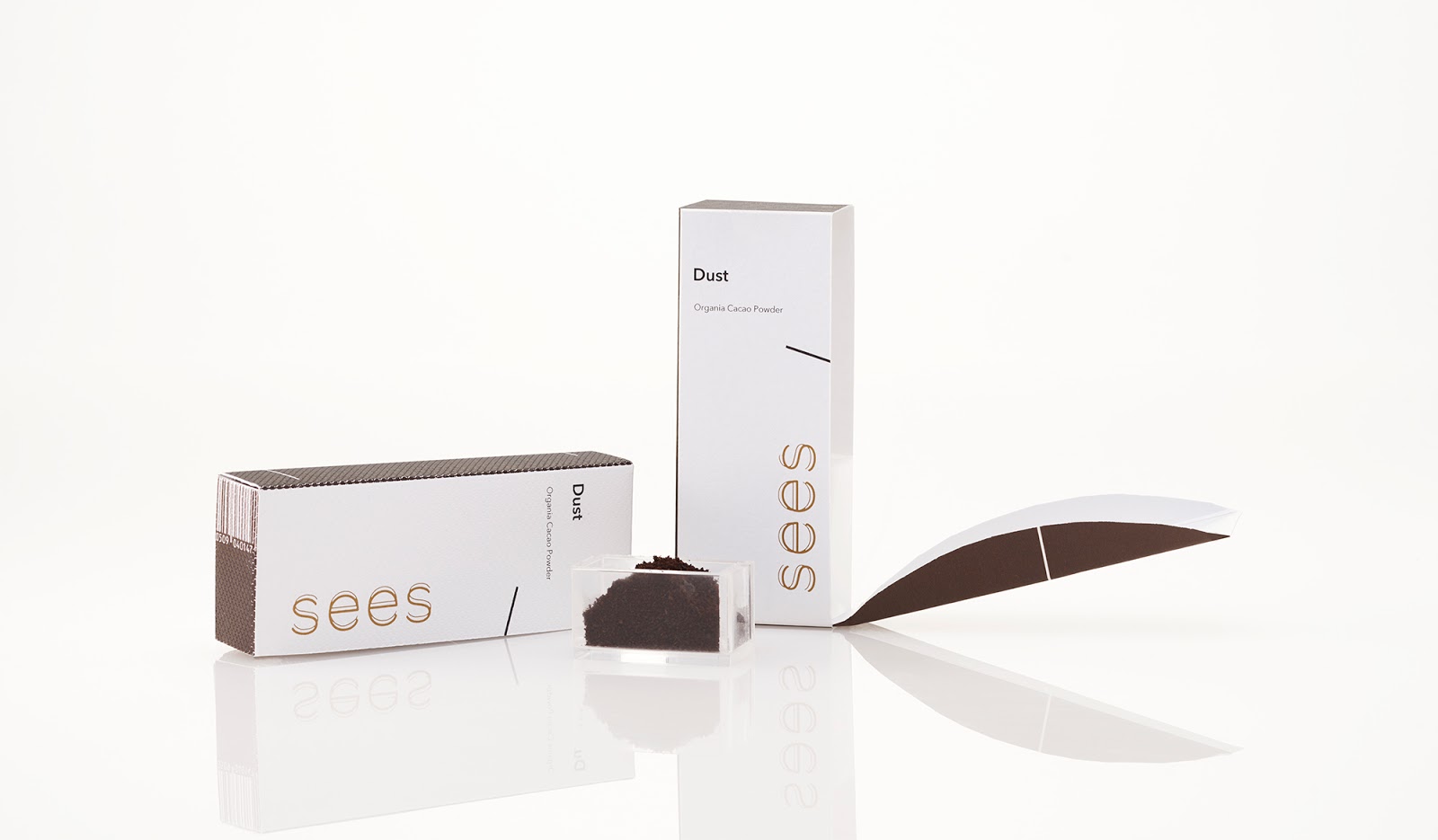
Packaging Contents: Chocolate
Packaging Substrate / Materials: Metallic Paper, 3d print
Printing Process: Laser, Chromatech, Digital Printing
See’s Candies has been making quality chocolate and candy Mary See’s way for over 95 years. The iconic black-and-white identity system is now out of date. In order to bring See’s Candies to the younger generation as well as keep the loyalty customers from their long brand’s history, See’s decides to rebrand the identity system and packaging.
The new See’s Candies provides a stronger personal and emotional connection between chocolate and people under the key attributes: Poetic, Stimulating, Sequential, Clean and Thoughtful. I explored different form structures inspired by the similarity between chocolate bar and book (bookshelf). The graphic elements are all based on the structure of the package itself, focus on the interaction between geometric elements and typography.
My focus is on making a portable and storable chocolate which is super easy to eat and clean as well as create an interactive eating experience which makes customers allure both the package and the chocolate.

What’s Unique?
The open ceremony of my package is inspired by the way how people read books and get books from the shelves.
The graphics theme is inspired by international typography style which is super strong on making interaction and connection, and I want to use visual elements to make customers feel connected and evolved into the products.