

Design: VBAT
Design Director: Peter Eisen
Brand Director: Elseline Ploem
Sr Packaging & Identity Design Manager: Ramses Dingenouts
Project Type: Produced, Commercial Work
Client: Heineken Global Design
Location: Amsterdam, The Netherlands
Packaging Contents: Beer
Packaging Substrate / Materials: Aluminium
Printing Process: Dry Offset
Over the years, the category code for beer has become busy and corporate with overly crafted messages. Brands must simultaneously tell their stories, reinforce their qualifications and jump off the shelf.
In 2018, however, Heineken felt it had reached a level of brand recognition that allowed it to explore a new packaging perspective. The can project arose out of Heineken’s drive to discover more powerful ways to visually express its renewed self confidence.
The brief was to make a bold statement. Our solution was to further iconise the brand by stripping away much of the corporate messaging and zoom in only on the recognisable details that make Heineken, Heineken.
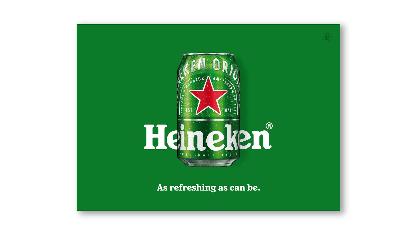
Zooming in is most of all an act of purification. The Heineken red star has always been fundamental to the brand’s identity, but by centralising it and amplifying it, we turned this ‘traditional’ brand element into a bright, bold and contemporary icon. More radical still was the decision to use the Heineken wordmark as a wrap-around text. Never legible in its entirety, the wordmark is fresh and playful yet still recognisable. A typographic can that resonates self-confidence and fun.
We applied this zoom-in approach across three Heineken propositions – Heineken Original, Heineken 0.0 and Heineken Light – creating a clear typographic family each with its own distinctive colour and category call-out.
Heineken unveiled its typographic cans in Mexico, Brazil, Poland and France.

What’s Unique?
The Heineken red star has always been fundamental to the brand’s identity, but by centralising it and amplifying it, we turned this ‘traditional’ brand element into a bright, bold and contemporary icon. More radical still was the decision to use the Heineken wordmark as a wrap-around text. Never legible in its entirety, the wordmark is fresh and playful yet still recognisable. A typographic can that resonates self-confidence and fun.
