

Agency: Pentagram
Project team: Todd Goldstein, Laura Berglund, Lorenzo Fanton, Sarah Corey
Client: Great Jones
Project Type: Produced, Commercial Work
Location: New York, USA
Packaging Contents: Kitchen wares
Pentagram’s Emily Oberman and team create a joyfully comprehensive brand identity for Great Jones, a new kitchen company that wants to equip and empower people to cook more frequently at home, even if it’s just frying an egg.
Great Jones is a new kitchen company that wants to equip and empower people to cook more frequently at home with a line of stylish and affordable cookware, even if it’s just frying an egg. Pentagram has designed a brand identity for the company that captures the warmth and enjoyment of cooking. The soup-to-nuts project encompassed everything from consulting on the look of the pots and pans, product naming and colors, to the design of the packaging, website and promotional materials, to messaging, art direction of photography and illustration, and social media.
Pentagram worked closely with Great Jones co-founders Maddy Moelis and Sierra Tishgart on the project. The distinctive name is an homage to the legendary cookbook author and editor Judith Jones, who published Julia Child and James Beard. The name is also a nod to one of New York’s legendary areas: Great Jones Street. The founders recognized a hunger in younger consumers who want to cook more at home and upgrade to higher quality cookware but find the multitude of product types, materials, sizes and uses on the market too confusing. Great Jones has pared down the choices to a selection of five essential pieces that are highly functional, beautifully designed, and nest to fit into small millenial apartments.

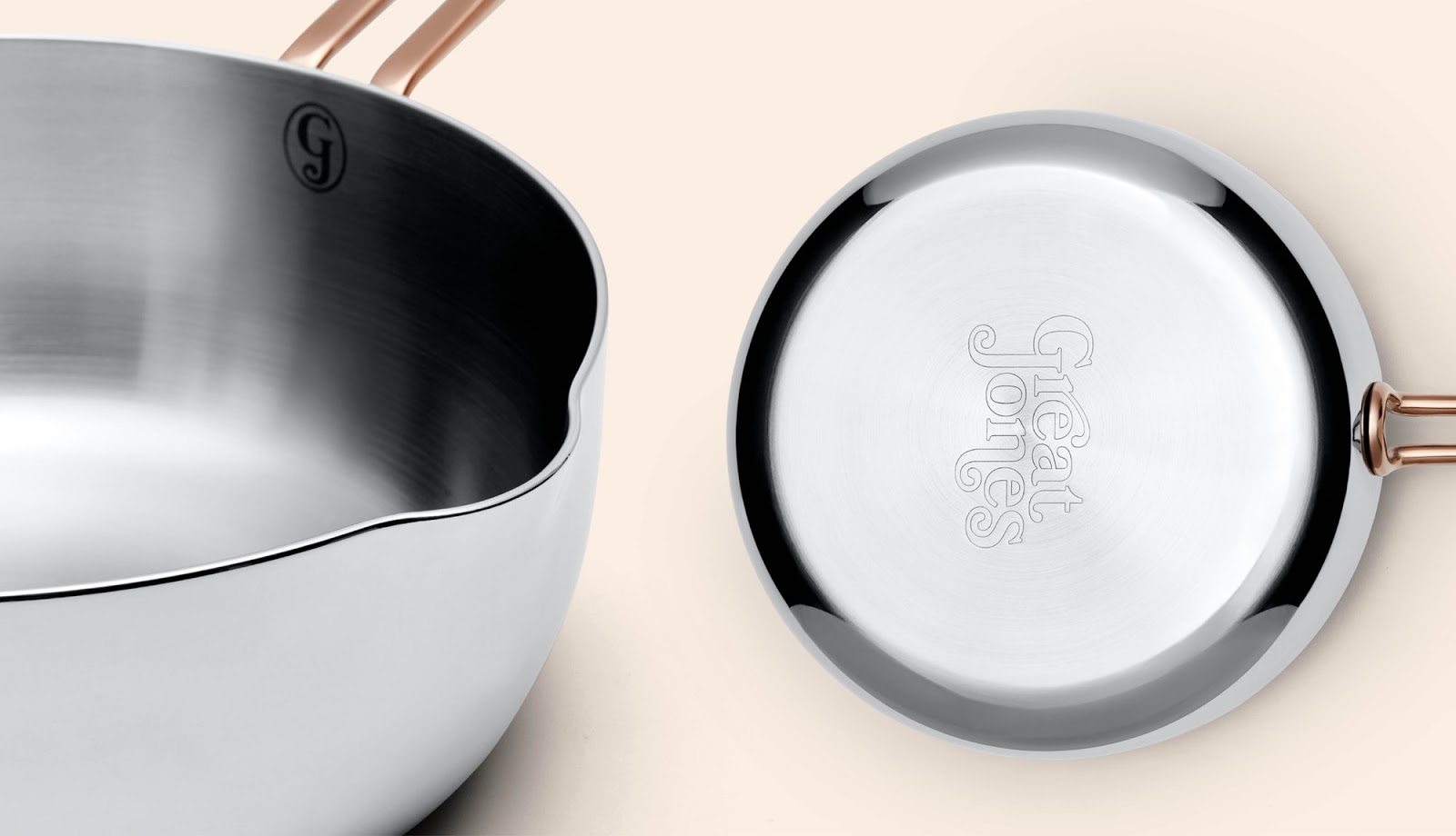
The Great Jones branding conveys the line’s accessible luxury with an exuberant, visually rich approach that stands out from the minimal style of most direct-to-consumer brands targeting millennials. Pentagram developed a vibrant look with jewel-tone vintage colors, lush illustration and witty messaging that resonates emotionally with consumers and taps into the nostalgia of cooking as a communal activity. The designers collaborated on the project from the beginning, consulting on the design of the cookware―including the contrasting brass-colored metal for the handles―selecting and naming the eye-catching colors for the enameled cast iron Dutch oven, and also in naming the cookware pieces themselves. The look is summed up in the tagline developed by the team as part of the messaging: “Ready to ware.”

The vintage vibe extends to the Great Jones logo, which looks fresh out of a classic cookbook. Customized from the serif Bookmania, the logo is awash in swashes for a friendly, outgoing feel. The team also created a “GJ” monogram that appears on cookware covers and inside the pans. Supporting typography is set in Cooper Medium and Cooper Light, rounded serifs that complement Bookmania, and the clean sans serif Hope Sans, which is used for measurement markers inside the pots, which also includes swashes. The branding is complemented by watercolor illustrations of food by the London-based illustrator Emma Dibben, whose rough, earthy style brings the natural ingredients to life.

Great Jones cookware arrives in colorful, instantly recognizable packaging that stands out from other boxes on the stoop. The team designed an unboxing experience that playfully introduces the products. The “Family Style” suite of the complete Great Jones menu comes packed in a special sleeve that wraps around the three boxes, with an illustration that turns the stack into an oven. (The tri-colors of the layered boxes suggest spumoni cookies.) Messaging on each box announces “Your ware is here!,” and interiors feature the illustrations by Dibben. Each piece comes packaged with a care card, potholder and refrigerator magnets. The care card unfolds to explain the step-by-step process of using the piece, outlined in hand-drawn instructions by the artist and writer Mari Andrew. The colored tabs of the care card are inspired by recipe cards, a graphic motif carried across the whole brand.

The color tab system extends to the Great Jones website, where it organizes sections and helps shoppers navigate. The company wanted its website to be not just an online store to buy the cookware, but also a fun place to linger, learn about cooking and become part of the Great Jones community. The designers developed a variety of entry points to the collection. The “Shop” section highlights each piece in the line, offering practical information about what cooks best in the pot or pan (the lids pop off to reveal the contents when the cursor rolls over) and how to take care of the cookware. Custom icons offer food suggestions and an illustrated chart by Mari Andrew describes what makes the piece great.

“Digest” is an editorial section built around the culture of cookbooks, including interviews with the “Great Ones,” celebrated chefs who share cooking tips and recipes from their own and others’ cookbooks. Throughout the site, bright, vibrant photography reminiscent of 1960s and 70s cookbooks shows Great Jones in action, with people making food at home using the cookware. The Pentagram team also created shareable graphics for social media, including quotes from renowned chefs and photo-illustrations that cheekily add Great Jones products to the covers of classic cookbooks.


