

Design: Autumn Tio
Project Type: Student Project
School: UW STOUT
Course: Graphic Design II
Tutor: Nagesh Shinde
Location: Eau Claire, WI
Packaging Contents: Mochi
Packaging Substrate / Materials: Cardstock
Printing Process: Digital Printing
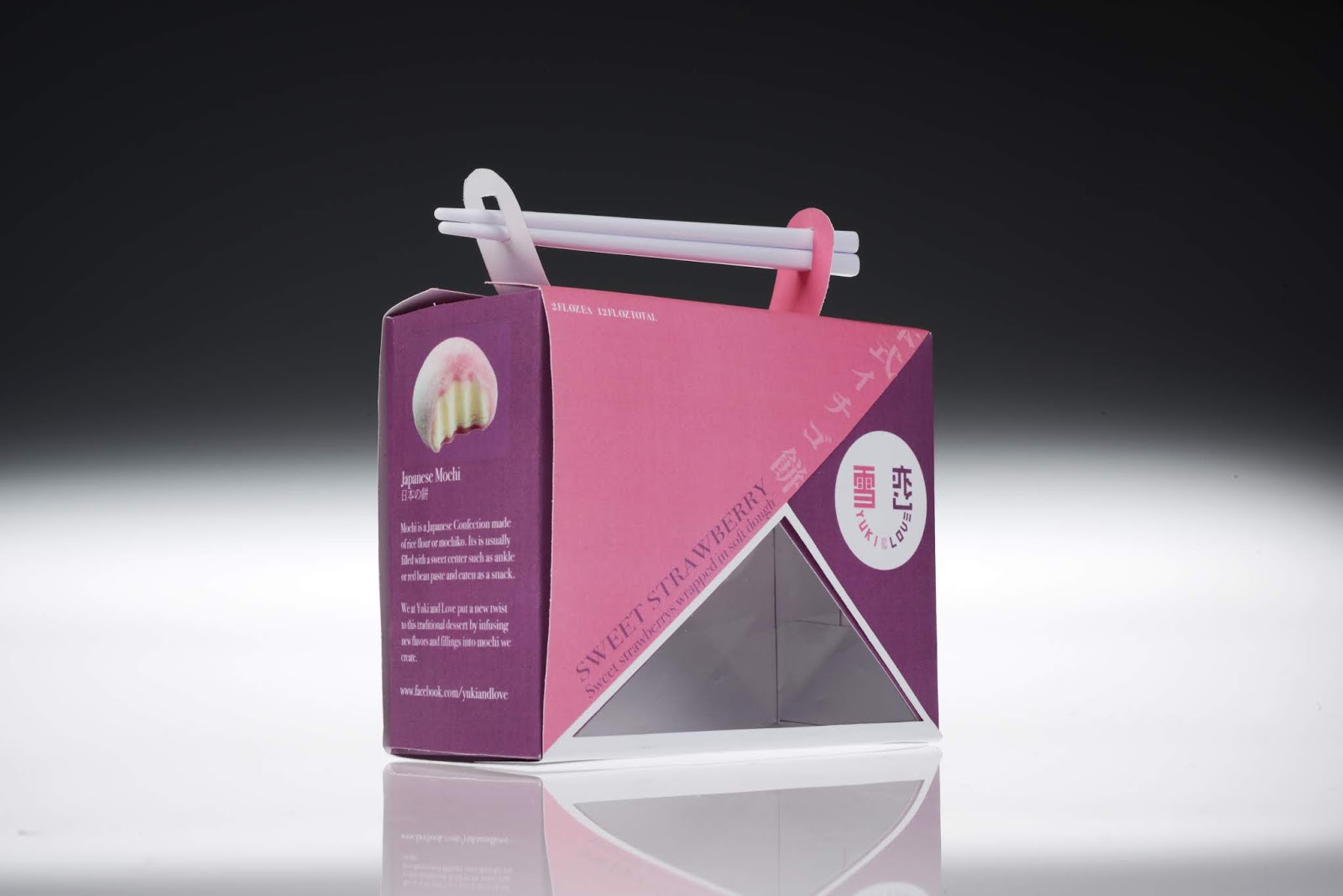
For this project the assignment was to rebrand a repackage a product that was under $10. I chose to redesign Yuki & Love Strawberry mochi mainly because there packaging and logo is hard to look at and i seemed like a challenge to me. My goal was to make a generic cheep product look premium. The first layer holding the mochi has a gloss effect while the outside layer around the first layer is matte in texture.
I added the chopstick handle on top to increase the premium experience and look. If you have ever eaten mochi its often coated in a sticky white flour that gets all over your hands, this way you will only get the chopsticks dirty and not your hands. This is a product that is meant to be shown off not just shoved in a Tupperware container or a plastic bag. the window in the front allows the consumer to admire the beauty that is the mochi inside.
What’s Unique?
The main thing that makes this box stand out is the striking chopsticks that act as the handle as well as a way not to get your hands dirty. The triangles create a dramatic premium look to the box as well as its cute size. Rather then just hiding the chopsticks why not make them stand out?


