

Design: HAJOK Design
Project Type: Produced
Client: Abafoods
Location: Italy
Packaging Contents: Milk alternatives, Cereals
Packaging Substrate / Materials: Carton
The new packaging design for the vegan brand Isola Bio brings the brand story to life, right around the pack! The combination of paper-cut illustrations and humorous texts underscores the concept full of zest for life.
The Isola Bio brand is a real organic pioneer. Not only has the company produced delicious vegan products since 1999, Isola Bio also focuses on sustainable production at its own farming estates and in patented manufacturing facilities in the south and northeast of Italy. From the cereals seed to filling the packs, a great deal originates from a single source: cereals, vegan milk alternatives or cooking creams that do without artificial additives. Just the ticket for all organic lovers who are looking for a healthy diet and attach great importance to a special taste experience.
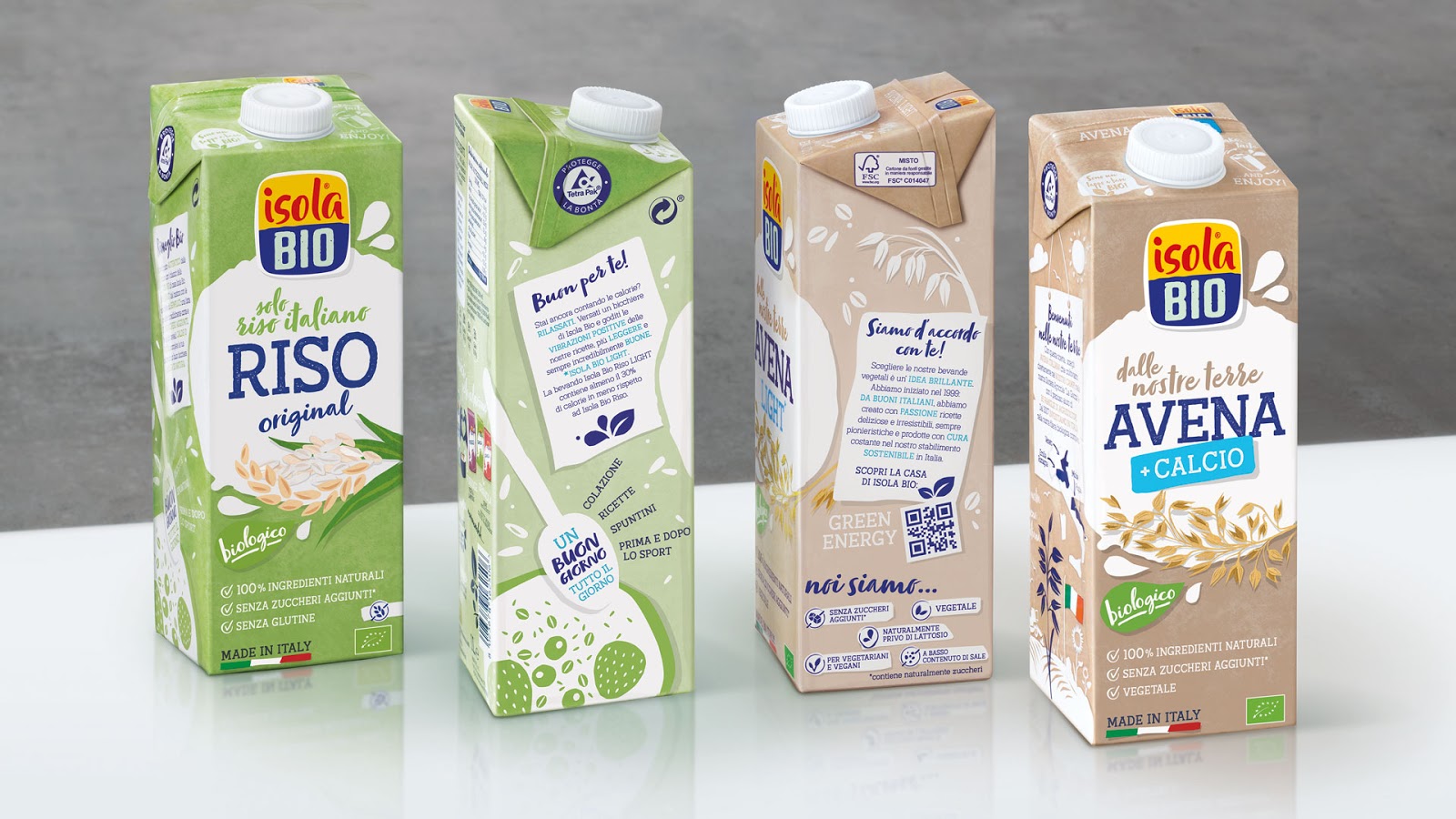
There are many positive things to say about Isola Bio – and this has to be realised in the right way on-pack! While the old packaging design was rather industrial and cool, the brand history and the main benefits – sustainability, organic and, above all, the care and quality – had to be intensively communicated. The main goal was to emotionally convey the promise of a “healthy explosion of taste” via lively packaging design and thus address a larger target group.

The new Isola Bio on-shelf presence is dynamic and succinct. The brand story is told in a charming way with a twinkling of the eye across the entire pack. The central element is the round key visual, which is interpreted differently according to the category. In the case of the milk alternatives, it is a milk glass with drops; in the case of cereals it is portrayed as a bowl with a spoon. The combination of illustrations and humorous texts underscores the fun-loving concept. Recognisability of the Isola Bio brand is achieved by means of the illustration style and the logo. The striking colours were retained, yet the shape and typography of the logo are now more organic and softer.


