Design: Michaella Ballas
Project Type: Student Project
School: RMIT University
Course: Communication Design
Tutor: Renato Gallina
Location: Melbourne, Australia
Packaging Contents: Sea salt flakes
Packaging Substrate / Materials: Paper, linen, ribbon
Printing Process: Digital printing, lino-cut, foil stamping
Kettle of Fish is a sea salt company that sources from the Great Barrier Reef. Targeted towards tourists, this proud Australian brand is sold at airports and souvenir shops. This package contains organic sea salt flakes.
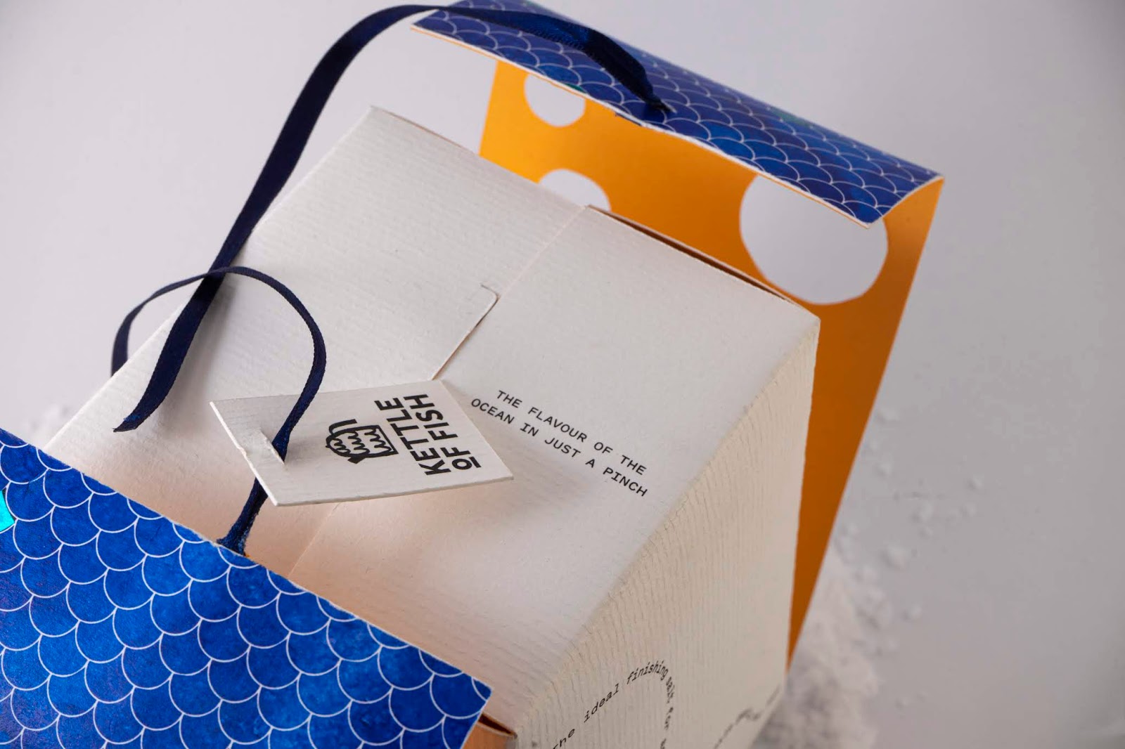
The brand name was chosen to reflect that the reef is like a whole new world, different from anything on land. The logo merges fish scales with a kettle, a clear reflection of the name, while simultaneously alluding to the reality that the reef is heating up due to climate change. The logo image was originally hand-drawn with marker.
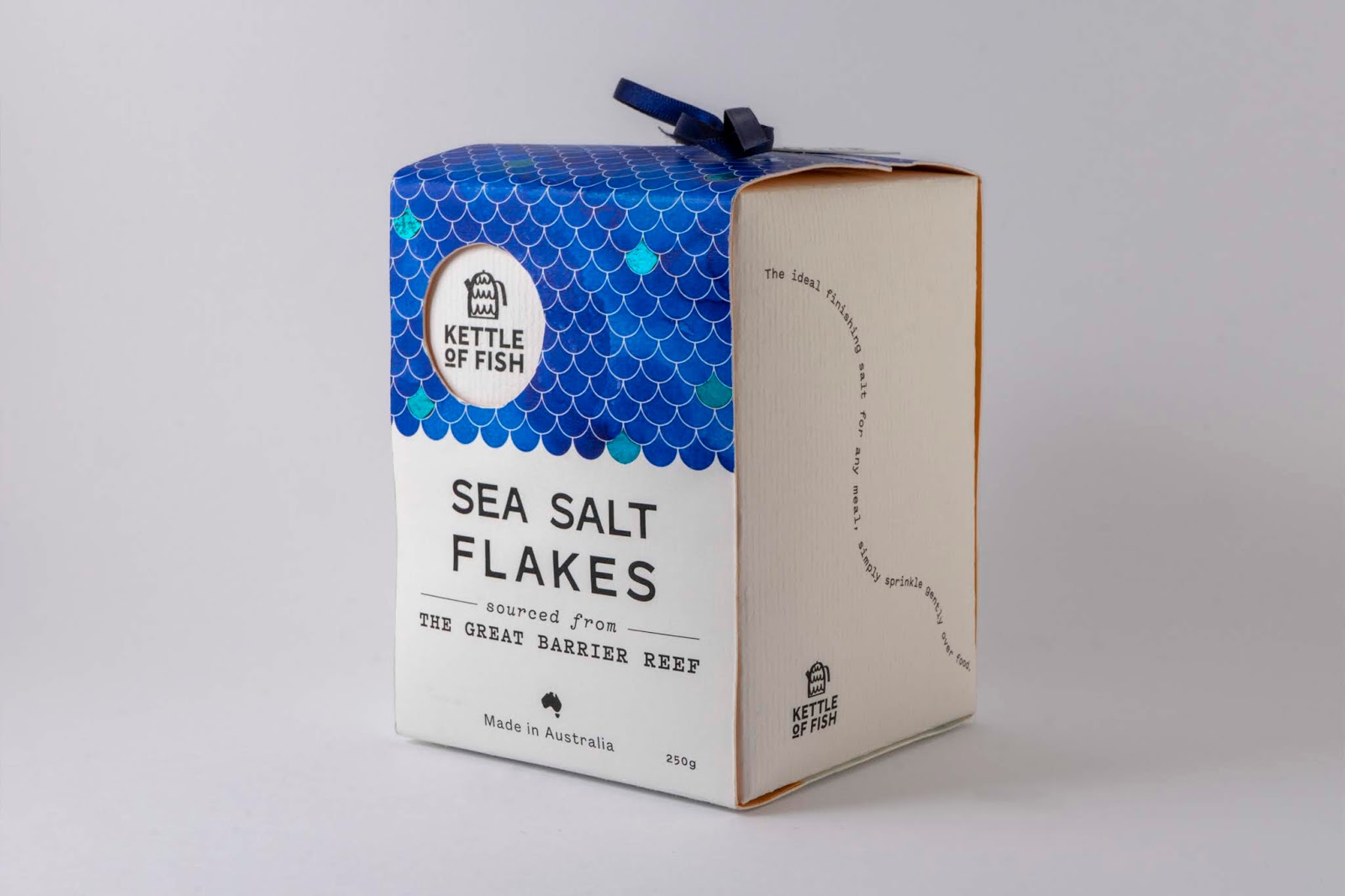
The tone of the packaging is light and fun and looks like a present. The concept behind the design the iridescent scales fish have, with blue foiling applied to some scales within the design. The scale pattern also looks like water, with die-cuts revealing fish swimming through. This references glass-bottom boats and snorkelling— typical touristic activities of the reef. The design of the sea-life was created by hand cutting linoleum to make stamps, while the colour behind the scales was originally painted in watercolour.
Uncoated paper, and a linen bag make up the packaging, and plastic is entirely avoided to remain sustainable. The package is light enough to carry onto a plane, while the linen bag is durable.
This is a hypothetical student project.

What’s Unique?
The box closes in a unique way, so that logo and fish can show through the die-cuts, as though you are looking through a mask. The bottom layer slides together, while the top has a ribbon closure.