

Design: WeWantMore
Location: Belgium
Project Type: Produced
Client: Brouwerij Roman
Product Launch Location: Europe
Packaging Contents: Beer
Packaging Substrate / Materials: Glass bottle, beer glass, paper, metal crown cap, cardboard gift set
Printing Process: Digital printing
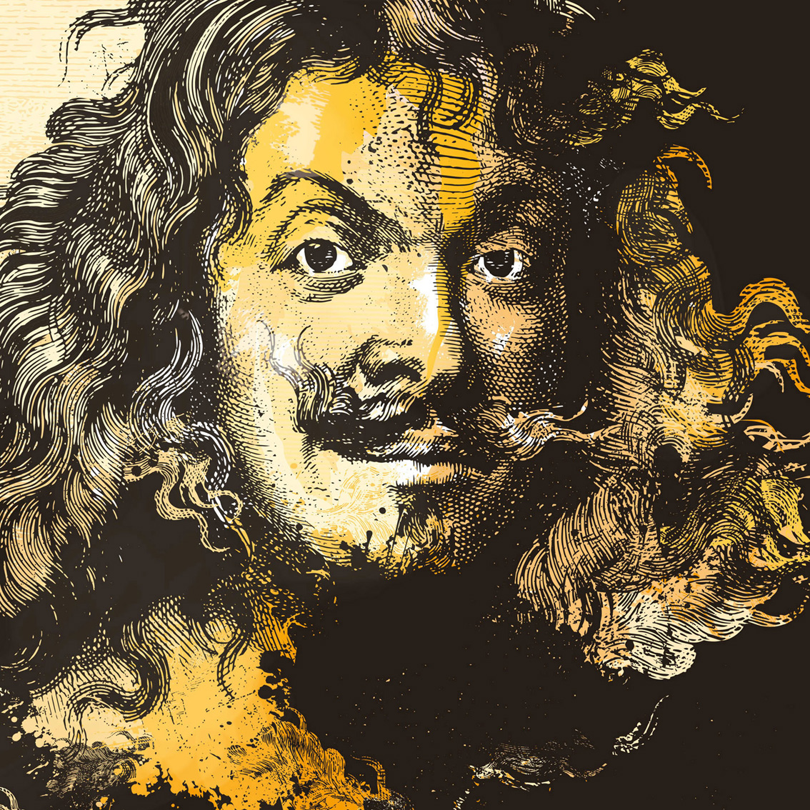
The rebranding of Adriaen Brouwer, an organic Belgian beer, was all about redefining what set the beer apart. The answer lied within the initial inspiration for the beer: Adriaen Brouwer himself. The Flemish painter’s work stood out during the Baroque Era because of his ability to capture raw emotions in trivial, but in-the-moment scenes in bars and pubs where people were smoking, fighting, drinking.
Capturing the ferocity and expressiveness that characterizes Brouwer’s work & personality, served as the main inspiration for the rebranding of the product. To reinforce the entire story even more, the final design also contains elements dating back to the middle ages like blackletters and heraldic decorative elements. An undeniable reference to the historic roots of the Flemish painter.
What’s Unique?
Adriaen Brouwer, a Flemish painter in the Baroque era, truly mastered the skill to visualize raw emotions in his paintings in a fierce way. We managed to capture that same ferocity in the label and packaging of the beer named after him.


