Design: Reynolds and Reyner
Location: Ukraine
Project Type: Produced
Packaging Contents: Mineral water
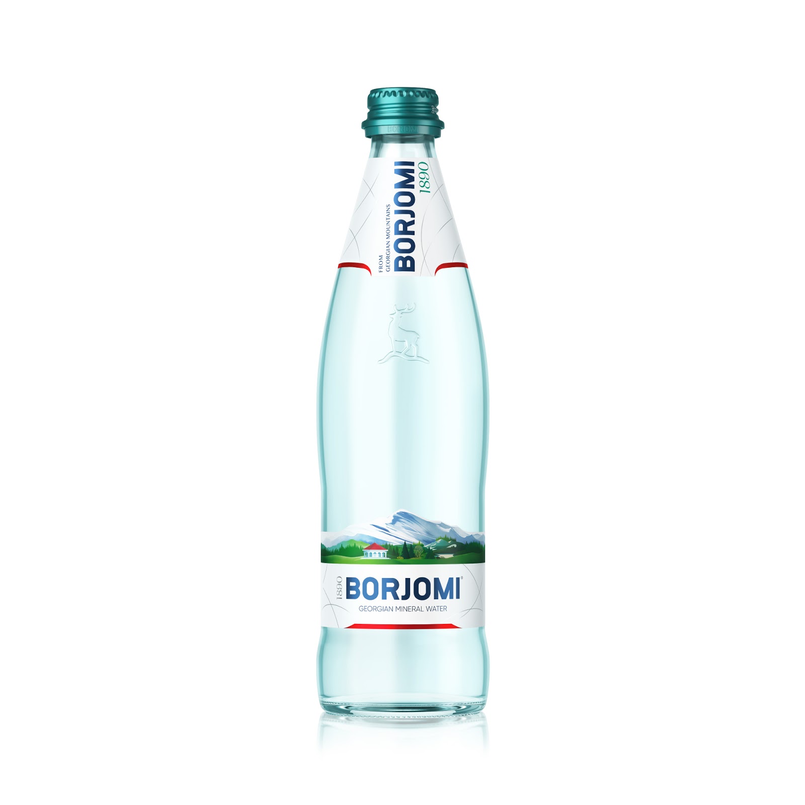
Reynolds and Reyner has redesigned the biggest Georgian water brand called “Borjomi”
The new design of Borjomi mineral water embodies the brand’s bold nature. The bottle has adopted a new style without losing its familiar image. Its well-known packaging now comes in a new look, with updated label designs and a change of color for the cap. The Borjomi logo has also been redesigned in a more expressive and up-to-date style. The general look will be more streamlined.The Borjomi design has responded to modern trends by becoming more dynamic and more simple and minimalistic at the same time. The shape of the label features the brand’s traditional colors. Silver projects lightness and premium class. The legendary “Georgian green” and dark red were inherited from the previous design. The new cap is also colored “Georgian green”.
The bottle still has its traditional symbol, a wild deer, which, according to a legend, was the first to discover the Borjomi spring. The more contemporary packaging complements the new Borjomi messaging: this water packs a punch and, with its unique and recognizable taste, is perennially relevant while being able to freely change its look.