Agency: Cue
Creative Director: Alan Colvin
Designer: Matt Erickson
Location: United States
Project Type: Produced
Client: Caribou Coffee
Product Launch Location: Global
Packaging Contents: Coffee
Packaging Substrate / Materials: Foil bag, paper label, aluminum can, plastic shrink wrap, cardboard box
Printing Process: Flexography, digital printing, offset printing, silkscreen printing
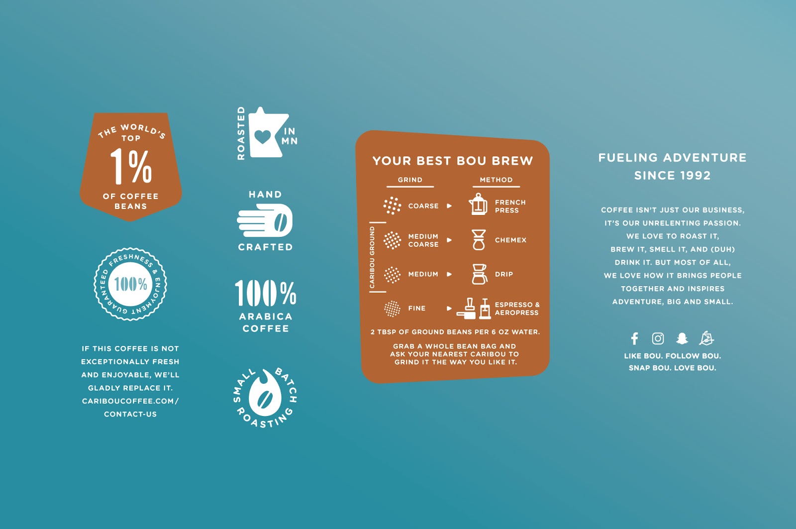
A brand with roots in the North, Caribou Coffee has been “Fueling Adventure Since 1992”, so it only made sense that the brief to redesign the brand’s signature packaging looked to its heritage for inspiration. Creating a “sense of place” not only offered a truer connection to its provenance but also created a proprietary expression to unify the brand’s portfolio. An illustrative interpretation of the North leans heavily on Caribou’s distinctive blue color. The result is a strongly-branded expression that’s premium, with a playful personality.

The label system architecture brings signature, flavored and single origin coffees into one system, differentiating varietals with color and pattern. Designations for ground, whole bean, decaffeinated and caffeinated products each have a place in the structure. Additional iconography is used on the package to convey coffee credentials and to make functional information like brewing instructions easier to understand. Copy is used both to convey brand personality and function. The whole system provides a toolkit of brand language designed to extend the brand across a growing portfolio of products.

New product innovation continues to grow the portfolio. Each addition draws on a robust toolkit of brand language, adding category cues and other essential information to work hard on behalf of the brand, and each product. Single-serve, ready-to-drink cold brew cans and growlers accentuate the brand icon with a bold personality. Other line extensions are strongly branded and add continuity to the brand at the point of sale.