

Agency: VBAT
Design Director (VBAT): Peter Eisen
Design Director: John Comitis
Design Director (VBAT) Marcos Cruz
Brand Director: Elseline Ploem
Account Director: Susanne Leydes
VP Marketing Heineken Brasil: Bram Westenbrink
Head of Design Heineken Brasil: Andressa Zeidan Tao
Location: Netherlands
Project Type: Produced
Client: Heineken Brasil
Product Launch Location: Brazil
Packaging Contents: Beer
Packaging Substrate / Materials: Glass bottle
Background
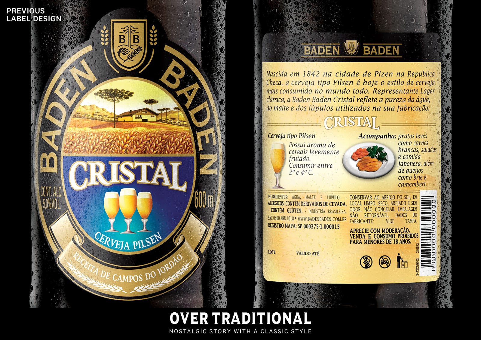
Baden Baden is a Brazilian craft beer brand situated in the picturesque region of Campos de Jordão about four hours outside of Rio. Founded in 1999, Baden Baden was named after the German craft beer it tried to emulate – beer that was too expensive for most Brazilians because of high import tariffs. For 20 years Baden Baden did this with great success. In 2019, they approached VBAT for a redesign. They were looking for an expressive and ownable visual language that would help them stand out in the increasingly cluttered Brazilian market. A new look that would reinforce Baden Baden as a category authority and a continuous pioneer in a market chock-full of audacious young beer pioneers.
Idea
‘Master traditions dare the traditional’ – this new slogan underscores an inherent dualism unique to Baden-Baden. A brand with unquestionable brewing credentials and a history of unorthodox innovation. We used this duality to create a broad playing field to work within. We completely redesigned Baden Baden’s industry-standard hop pastoral label with the local Araucaria tree, indigenous to the Campos do Jordão region. We introduced an open modern shield and strong, confident BB icon that eyes traditional at first, but when mirrored offers a twist. We created a label that gave the brand consistency across all its products but also functions as a canvas on which to vocally broadcast the brand’s many flavors and styles using a bright color palette. The result is Brazilian without resorting to national stereotypes or gimmicks. On the back of each label, we include food pairing suggestions to further underscored Baden Baden’s role as an open-minded guide in an ever-changing craft beer market.

Learnings
You have to see it to believe it. Kicking off this project in Baden Baden’s hometown Campos do Jordão was key to the whole process. Campos do Jordão is not just the brand’s HQ but a place that beautifully reflects the brand’s unique dualistic character. On the one hand a picturesque hideaway on the highest mountain Brazil with Alpine architecture, ‘Sauerkraut und Wurst’ restaurants and the only place in Brazil where people wear winter clothes. On the other hand, a town that embraces the typical Brazilian energy full of bright colors, Araucaria trees, and Latin American machismo. These two seemingly opposite attributes fueled the creative process in a way no written brief could have done.

What’s Unique?
1999 is ancient history for microbrewers, but for Baden Baden we used this heritage to construct a master crafts(wo)men story that distinguishes it from all upstart brands. We reinforced Baden Baden’s already authoritative craft brewing status and introduced bright bursts of local color to amplify its Brazilian roots and exploratory nature. The new-look soft-launched in October 2019, so it is still too early to tally results. However, this is what Bram Westenbrink, VP Marketing Heineken Brasil, had to say about the redesign: “The new look has radically changed the perception of our brand in Brazil. It essentially creates for us our own category between the mainstream brands and local brewers. Our clients, partners, and stakeholders are unanimously excited, and I am confident consumers will follow.”

