Agency: BexBrands
Creative Directors: Jeremy Dahl, Becky Nelson Dahl
Art Directors: Molly Mann, Aaron Bueg
Location: United States
Project Type: Produced
Client: Bumble Bee Foods
Product Launch Location: United States
Packaging Contents: Seafood
Packaging Substrate / Materials: Can, Pouch
Printing Process: Offset, Rotogravure
Bumble Bee Seafoods has been around since 1899 and over its lifespan has made minor changes along the way. With a recent surge of other shelf-stable seafood brands, they needed to make slightly more drastic changes to engage new customers, who are interested in sustainable seafoods with more adventurous flavors in convenient formats.
At the same time, they still wanted to make sure they didn’t lose their loyal customers who account for a large percentage of their business, buying canned tuna on a regular basis.
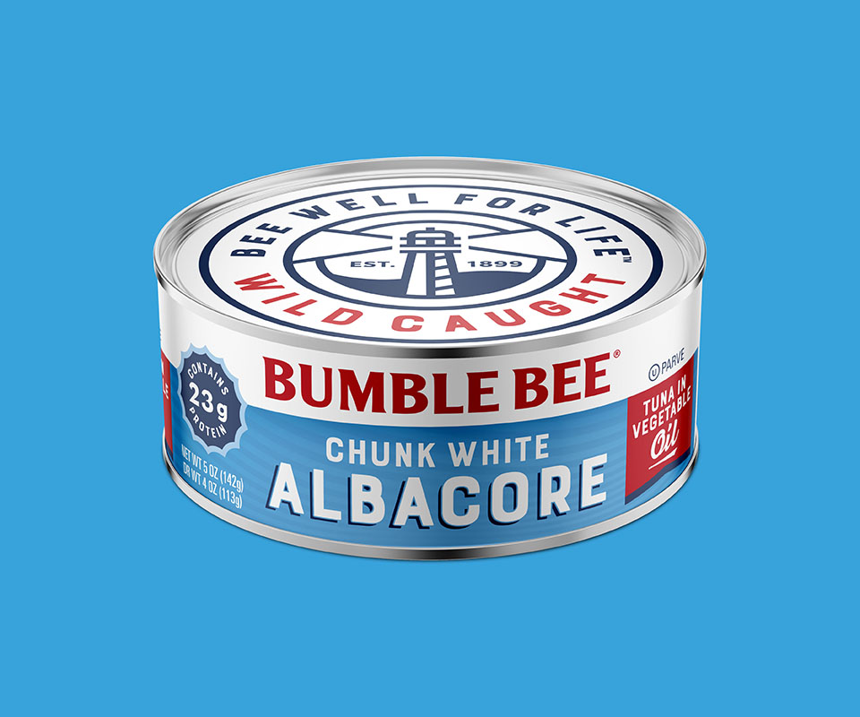
We retired their bee character, Horatio and replaced him with a lighthouse, symbolizing Bumble Bee as a beacon for its sustainable, delicious seafood offerings. The bold type and strong colors help support this communication.

Typography and colors remain bold and close to the past iterations, but they’ve been slightly adjusted to a communicate a more modern and approachable attitude. The monochromatic wave texture adds depth and sophistication to an otherwise flat color block, that separates easily from the consistent brand block, creating a clear hierarchy of communication.
For the cans, modifications were minimal and pouch packaging changes were more dramatic, but you can see there’s a clear thread of ownable & recognizable brand elements that ties it all together.

Sharp, high-impact photography adds energy and taste appeal to our flavored pouches, making everything look super tasty! On the unflavored tuna cans, the flavor ingredients are replaced by a freshly illustrated tuna, showing source as it appears as though she is swimming through the water wave textures.
The overall look is bold and delicious, the communications are clear and friendly, speaking to consumer visually and with copy in a way that’s consistent with Bumble Bee’s offering of convenient and tasty seafoods!

What’s Unique?
Our focus for the tuna pouches was the flavoring ingredients versus the fish. The packaging combines both nostalgic and modern elements in a way that feels seamless.