

Agency: Hopa Studio
Art director: Marcin Paściak
Graphic designer: Iwona Drewniak
Naming & copywriting: Julia Cieszko
Location: Poland
Project Type: Produced
Client: Abriga Poland
Product Launch Location: Global
Packaging Contents: Cosmetics
Packaging Substrate / Materials: Glass
Printing Process: Offset
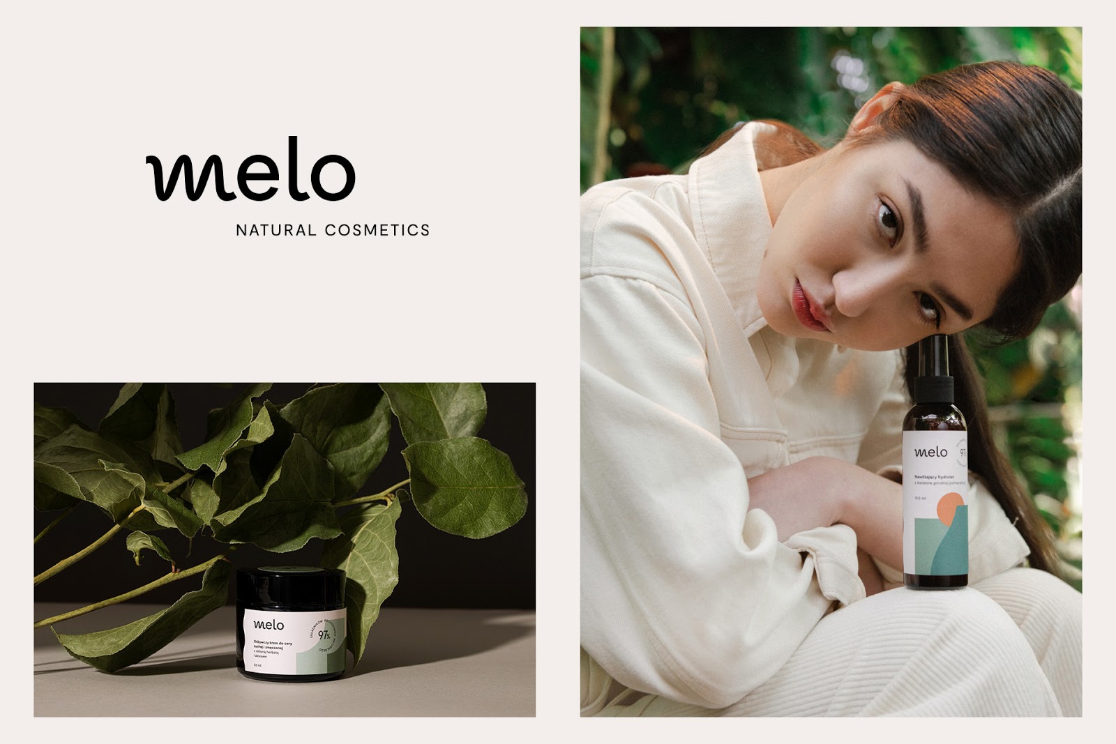
Melo is a series of natural cosmetics composed exclusively of plant and mineral ingredients – without artificial additives or unnecessary preservatives. New, extremely feminine products for everyday care. Thanks to their formulas and local production, they’re effective and maintain the highest quality.
The challenge for Hopa Studio was to design a brand that will combine the premium products segment with the currently popular “natural formula” trend. Through the proposed solutions – naming, visual identity, packaging, copywriting – we wanted to create a new sense of “green beauty”.
The target group for the brand includes active women, focusing on the “wellness” trend, taking care of their diet, physical fitness and skincare. The products were to become a daily “companion”, so in addition to their natural formula, aesthetics have a significant role in the purchase process. The customers require modern solutions, exceeding the aesthetic schemes in that product group.
Hence, design became essential – it was supposed to be “light” friendly, associated with nature, and at the same time pointing to a high-quality product. We wanted to create packaging that customers would be happy to place next to their favourite cosmetics in the bathroom, to create an atmosphere of a home “spa”, portray the beauty of day-to-day life, give a sense of communion with nature. Minimalistic, well designed, and with a strong character.
We converted the proposed creative strategy for the brand into naming, visual identity, copywriting and packaging. Melo was the result. Honestly good cosmetics – home spa products combining both naturalness and effectiveness of everyday cosmetics with good design.

During the design process, we collected important associations which ultimately built the aesthetics and identity system. We reflected nature in graphic forms: light, water, stones, plants. We presented a seaside landscape with rocks, sky, pieces of fruits and flowers. In the creation of colour schemes and graphic objects, we were inspired by the components of the Melo products.
Visual identity is based on a system of common elements. All packages combine graphic objects such as a wave on one of the edges of the label, colourful stickers on product lids, or a repetitive arrangement of shapes.
The basis of the graphic design of the packaging consists of geometric shapes overlapped with one another and softened by modern forms, referring to natural geometry: waves, curves, circles. On the products with the same ingredients we have reproduced the colours and graphic motive, but with different layouts.


