

Design: DesignRepublic
Location: Belgium
Project Type: Produced
Client: Stassen
Product Launch Location: Europe
Packaging Contents: Fruit Cider
Packaging Substrate / Materials: Glass Bottle
STASSEN, THE FRUITY SIDE OF YOUR PARTY.
Branding & Packaging Design, Stassen is part of the Heineken group, one of the biggest cider producers in the world.
Stassen’s fruit ciders are all about fruitiness, a festive fresh & fruity family aperitif.
When we were approached to redesign the Stassen bottle label, the main objectives were to express fruitiness, to make the design more up-to-date and stay accessible for a wide range of customers.
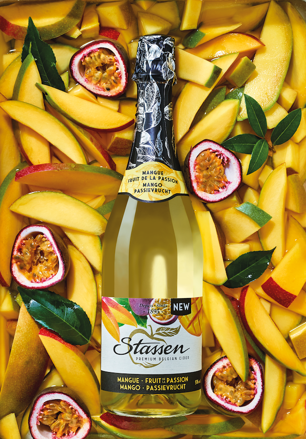
Using vibrant photography of the flavoring ingredient(s) was our first step to express an appealing fruitiness. And what better way than to integrate white into the design to add freshness? By placing the Stassen logo horizontally, we made sure that existing customers would find their brand back easily after our redesign. To make the bottle even more fruity, we used a color coding on the bottleneck labels.
The result is a fruity cider design for everyone’s taste and a fruitful design for Stassen.

What’s Unique?
We succeeded by our design to make this quite old fashioned drink again appealing to millennials.
