Design: Reynolds and Reyner
Location: Ukraine
Project Type: Produced
Client: Marengo [BAYADERA GROUP]
Product Launch Location: Europe
Packaging Contents: Vermouth
Packaging Substrate / Materials: Glass bottle
Printing Process: Digital printing
Marengo, the Ukrainian vermouth market leader is a vivid and modern brand that creates a truly festive atmosphere for friendly activities. Marengo is the brand with a more than 30-years history, always striving to play the central role in the vermouth production industry. In the non-static world, it is important to undergo constant updates and be trendy due to what brand Marengo has successfully evolved in its design with the new vision and new content.
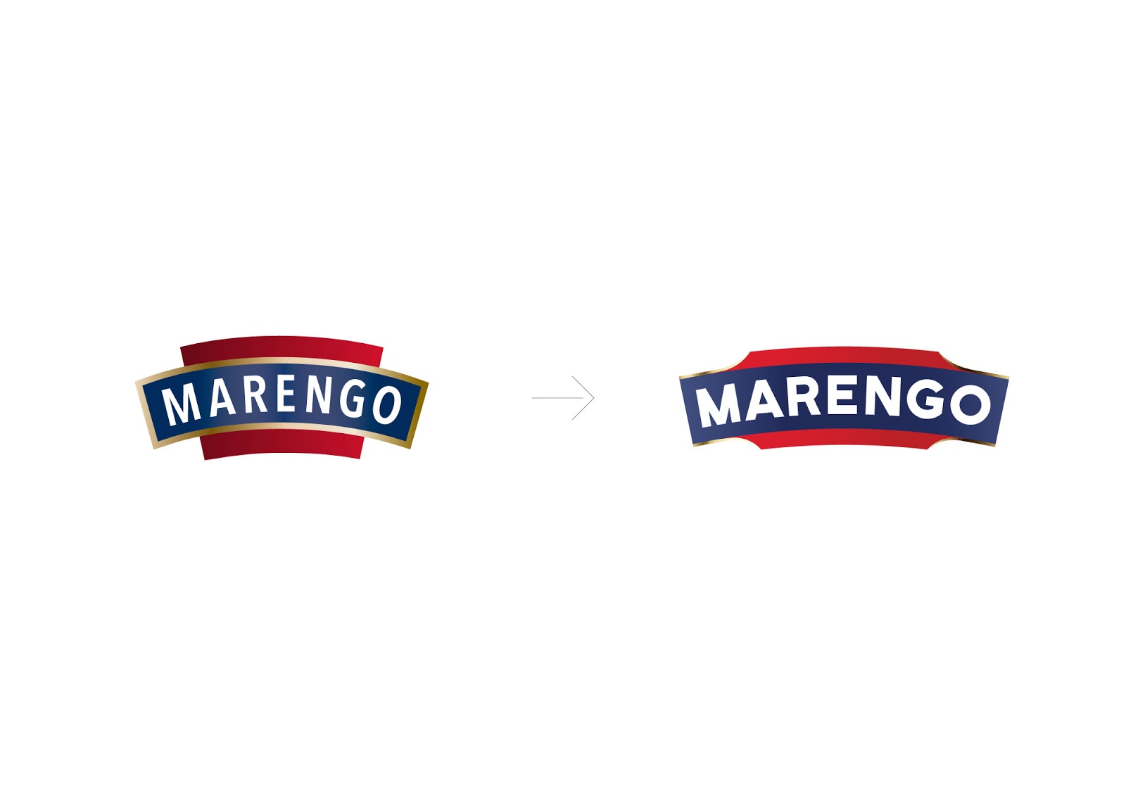
Within the redesign project, the bottle has changed. Developed with blow-blow technology, i.e. convex bottom formation, it grew higher, larger in its value and thus more prominent on the shelves. Though the colours of Marengo were not changed to save brand recognition, the label design has been upgraded. The logo grew wider and more visible. The letters are entirely handwritten. Though the coat-of-arms is designed from scratch, it preserved the principal features of the old one.
One can already encounter the updated classical vermouth taste Marengo Bianco and possessing Mexican to drink summer refreshing flavours Marengo Mojito throughout the shelves. With the new Marengo design, you are welcome to enjoy the bright quantum of the taste of the drink, unique, refined, and crafted according to the Italian recipe. All the Marengo drinks are solely produced of natural grapes, nuts, herbs and spices.