Design: Shubhra Tiwari
Location: India
Project Type: Student Project
School: MIT Institute of Design
Packaging Contents: Mint candy
Packaging Substrate / Materials: Cardboard
Printing Process: Litho lamination
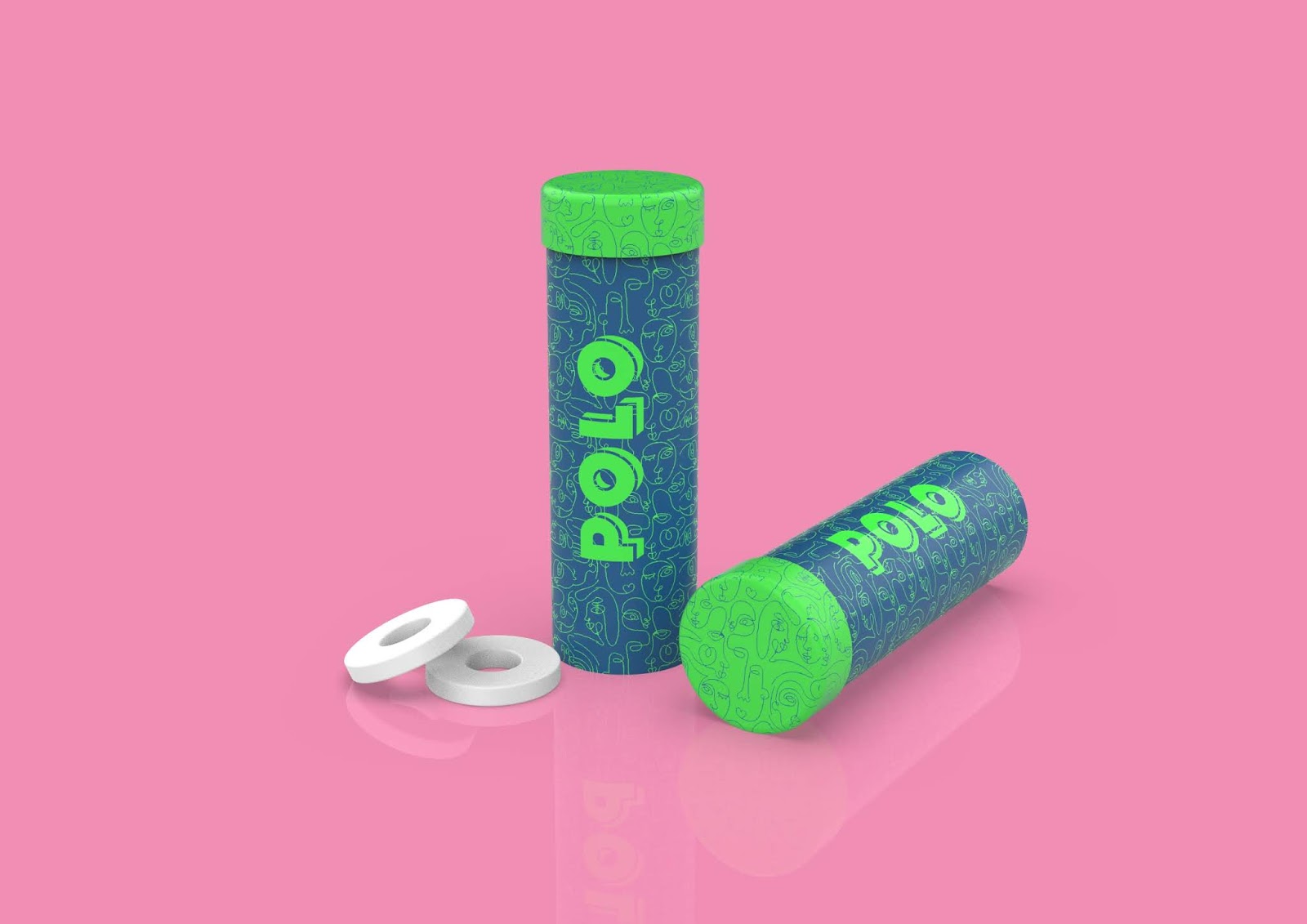
POLO is a mint that is known by all and shared by all. This packaging is based on the theme “POLO binds us together”. The packaging is designed to make the candy easily accessible and to make it graphically youth-friendly.
It’s a shareable pack of twenty mints. There is a stick that passes through the hole in the center of the candies and the stick is attached to the base. When we pull up the central stick, stacked POLO mints come up as well, making it easily accessible and easy to store.
The graphics have different human faces joined together in abstract form. This is done to reflect the idea of sharing and to show that sharing brings us together.
This mint is available in three flavors: Original, Fruit and Spearmint. The colors used are green, pink, and ocean blue respectively which are fresh and young colors and goes with the theme. The design focuses on giving POLO a new fresh vibe while maintaining the original identity.
What’s Unique?
This packaging makes mints easily accessible and easy to store. The packaging graphics gives it a new youthful vibe while maintaining its brand identity. It also promotes the marketing strategy of “POLO binds us together”