

Design: Firebrand
Location: India
Project Type: Produced
Client: NIC – Natural Ice Cream
Product Launch Location: India
Packaging Contents: Ice Cream
Packaging Substrate / Materials: PPE Biodegradable plastic
Printing Process: Digital Printing
NIC natural ice cream was launched in the year 2014. After 4 years of being in the market, they realised that despite their product winning all the blind-tasting challenges versus competitor brands, they weren’t able to establish the top of mind recall among consumers. NIC’s packaging was similar to the competitor brand and reflected no personality and story of its own. Hence after 4 years of building the product, the company called for a brand overhaul.
NIC’s flavour offering comprised of classic, fruit, global and local Indian flavours. The innovative flavour offering was the USP of the brand apart from the fact that the product was natural with no preservatives. In the crowded market segment of ice creams, the real challenge lay in telling a compelling brand story through its packaging that was original, differentiated yet authentic.
After rigorous consumer studies and market landscape studies we uncovered that for most consumers seeing the product and the ingredient on the box were important parameters in influencing the purchase decision. The challenge lay in building a packaging system that was flexible enough to accommodate the existing range of flavours yet keeping way for future flavour expansion. NIC typically launches a new flavour every 2-3 months.
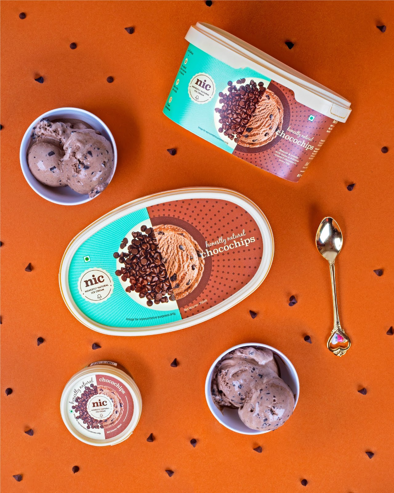
We started by establishing a strong brand essence of “Honestly Natural” that stood not just for the product category but also the values and ethics of the brand. The visual idea for the packaging came from the fact that – “If you cut NIC’s ice cream into half, all you’ll find is the ingredient. And nothing else.” We based our entire brand system on the concept of half and half.
We played with the idea of the perfect scoop – a well-rounded sphere that became the key design element and a window into communicating the link between the pure ingredients and the ice cream. NIC’s flavour variants consisted of fruity, Indian, global and classic flavours.

As the primary brand colour, we picked a distinctive pastel shade of green that not just stood for purity but also represented freshness. The deep colours of the various flavours brought in vibrancy. The cream shade used in the base of the box was to complement the primary brand colour yet signify the creamy nature of the product. Additionally, for each flavour, we developed textured patterns inspired from the appearance of the ingredient itself – for example, dots for choc chips, waves for caramel etc. which added a subtle visual layer to the packaging. Viewed from any surface, the brand elements and flavour are always visible, making it recognizable, enticing and delightful.
For the information architecture, we used typography and simplified icons to depict the source of the ingredients enabling customers to know exactly what’s inside the box reaffirming the brand promise of ‘Honestly Natural’.
In summary, the key elements that helped differentiate the packaging comprised of a spirited colour palette, subtle patterns, visual hierarchy, informed content and enticing photography.

What’s Unique?
The brand concept of “Honestly Natural” – reflects not just in the dynamic design system but also comes through in the choice of colours. The Brand colour of the distinctive pastel green hasn’t been used before for ice creams in the Indian Market.


