

Agency: DEZA
Project leader: Irina Shmidt
Art-director: Jane Djhurinskaya
Strategist: Dasha Erasova
Designer: Elena Ivanova
Project Manager: Marta Bekker
Location: Russia
Project Type: Concept
Packaging Contents: Baby, Health, Children’s stuff, Pacifier
Lubby — brand of children’s goods. The market of children’s goods in Russia and around the world is developing rapidly, changing the portrait of the consumer, his behavior. Modern mothers enjoy life, a new role and themselves in this role. All this requires new approaches from children’s brands to communicate with their audience, including through packaging.
Lubby’s audience is ambitious young mothers who live here and now. They do not sacrifice themselves for the sake of the child, they continue to lead an active life — as their baby and themselves like it. It is important for them that the products for children are not only convenient and safe, but also fashionable. They see motherhood not as a boring daily routine, but as a new cool experience. Therefore, the Lubby brand should not only show the benefits of the product, but also involve moms in the dialogue, demonstrate that he speaks the same language, understands their desires and creates a special, recognizable mood.
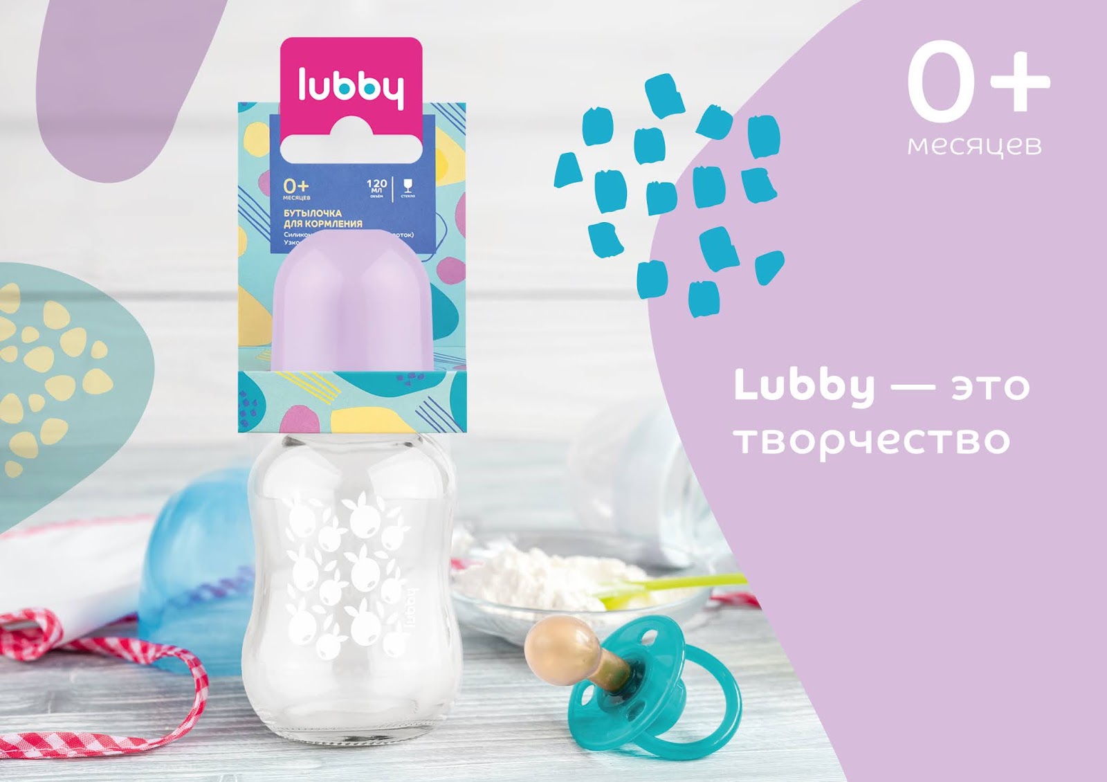
The design concept was born from the essence of the brand: being a mother is Lubby. To be a mom means to express your individuality and realize ambitious creative ideas, to enjoy yourself and your life, setting an example for others. Here, Lubby becomes a definition of lifestyle of a modern active mom, as friendly or trendy. To be such a mom is cool, easy, interesting; and all this is Lubby.
The concept is visually unfolded through bright patterns that symbolize the different moods, many opportunities for young mothers to express themselves. We have developed a whole system of elements, a constructor, each time giving a new unique pattern. It is a metaphor for the uniqueness of motherhood, its brightness and the possibility of creative approach to it.

Lubby products are distributed by age categories with the help of color scheme and different graphic elements: for the smallest patterns are smoother and quieter, for older kids — brighter, more active, braver. This method makes it possible to create any “art compositions”, thereby expressing the essence of the brand and personality of each mother.
Bright and attractive packaging complements the world of beauty, joy and individuality around the child and his mother. Now it is a kind of fashion accessory, part of the lifestyle of ” Lubby’s mom” and confirmation of the key idea: motherhood is Lubby.


