

Design: Aryahi Agarwal
Location: India
Project Type: Student Project
School: Unitedworld Institute of Design (Gandhinagar)
Packaging Contents: Liquid lip colours
Packaging Substrate / Materials: [Glass, Plastic (Primary packaging)] , Cardboard(Secondary packaging)
Printing Process: Digital printing, Flexography, Lithography
The project ‘Allure’ was cooked for a classroom assignment and the module was named as ‘Packaging design’.
We were asked to imagine a tangible product (cloth,food,cosmetics etc) which our brand will produce, and do deep research and analysis of the similar product in the market. The main motive was to come up with a form and design unique surface graphics for the product which was supposed to be rendered in a 3D software known as ‘Blender’.
For the advertisement and promotional purposes, we were also supposed to design a poster announcing the launch of the product.

ABOUT THE BRAND: ‘Allure’ is a luxurious brand which produces lip liquors with the goodness of real flowers and SPF 10 in it. The brand is known for its colour variation from bold to nudes.
It has two variations according to the customer need:
1.ALLURE GENEVA- Glossy lip liquor.
2.ALLURE PREMIUM- Matte lip liquor.The packaging has been designed in such a manner, which gives the product a unique identity in the market. According to the range and cost of production, both Primary and Secondary packaging is designed to attract the higher middle class people.

PRIMARY PACKAGING: The Primary packaging has two variants which can be recognized by the variation in material.
The material of ‘Allure Geneva’ is shiny and glossy whereas ‘Allure Premium’ has matte finished body. The USP of the packaging is the glass lid with the small hanger inside, creating the brand identity of the product in the market.
The labelling on the packaging is quite minimal and easy to understand with all the necessary information that a customer would require for easy buying of the product.

SECONDARY PACKAGING: The Secondary packaging again has two variants which could be recognized by the variation in surface graphics. Both the variants look quite different from outside as they differ in terms of colours and surface graphics.
The similarity in both the packaging is the ‘Style’ (the way it opens) and the ‘Labelling’ of the brand. To create a brand remembrance, a logo is added on the top of the lid in Secondary packaging.
It holds three sided labelling with all the necessary information related to the product and the brand.
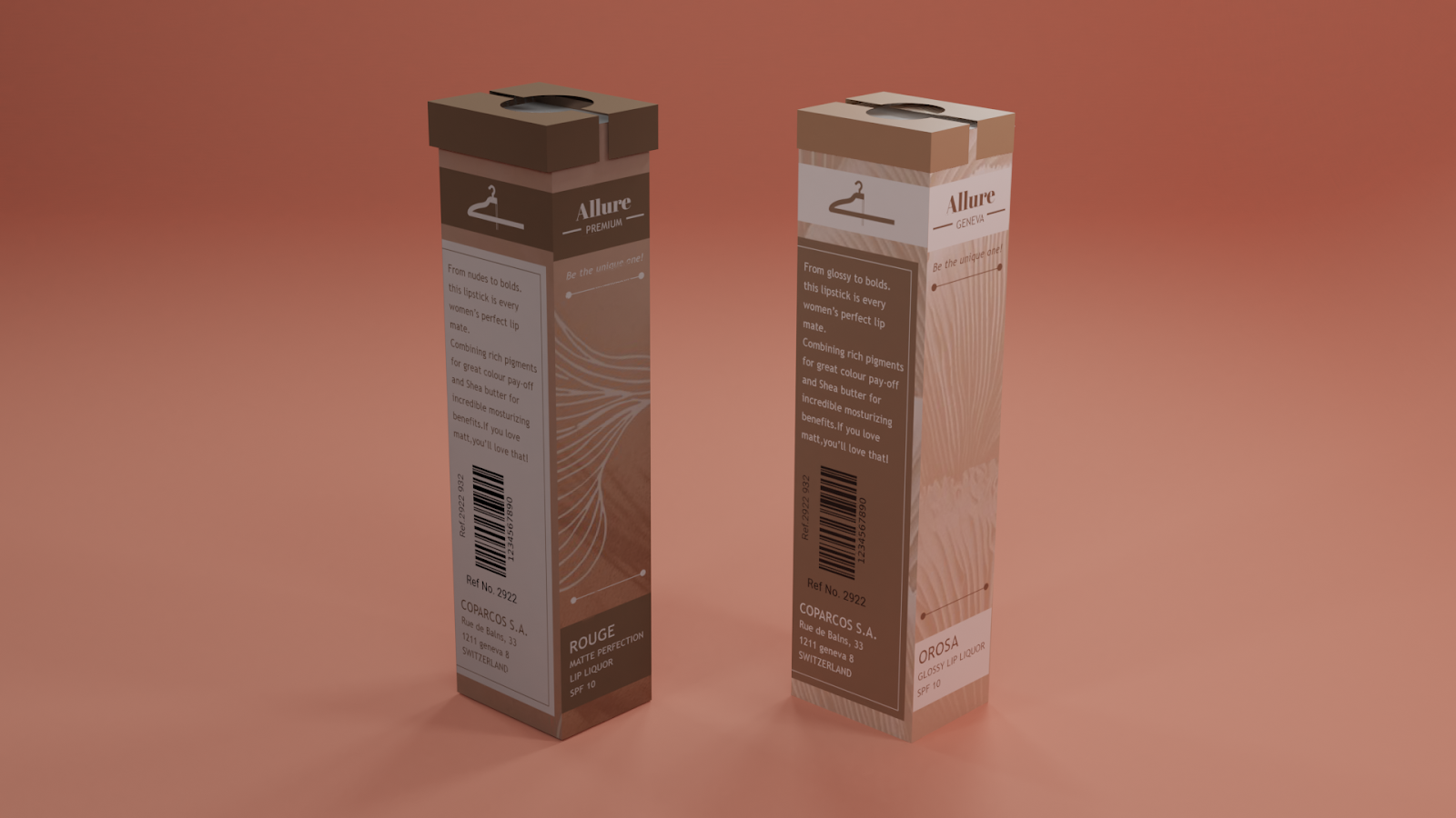
What’s Unique? PRIMARY PACKAGING: The one thing that makes the product stand out in the market is the ‘Glass lid with a small hanger’ inside to create brand identity.
SECONDARY PACKAGING: The lid which has logo on the top and the unique opening technique which has magnet for sealing the primary packaging inside from breakage. (as the lid is made of glass.)

