Agency: Unblvbl Branding Agency
Designer: Alena Orlova
Photographer: Anna Garanicheva
Art-director: Timur Saberov
Manager: Alexander Karzaev
Location: Russia
Project Type: Produced
Client: Lanors
Product Launch Location: Europe
Packaging Contents: Paints
Packaging Substrate / Materials: Plastic bucket
Printing Process: Direct print
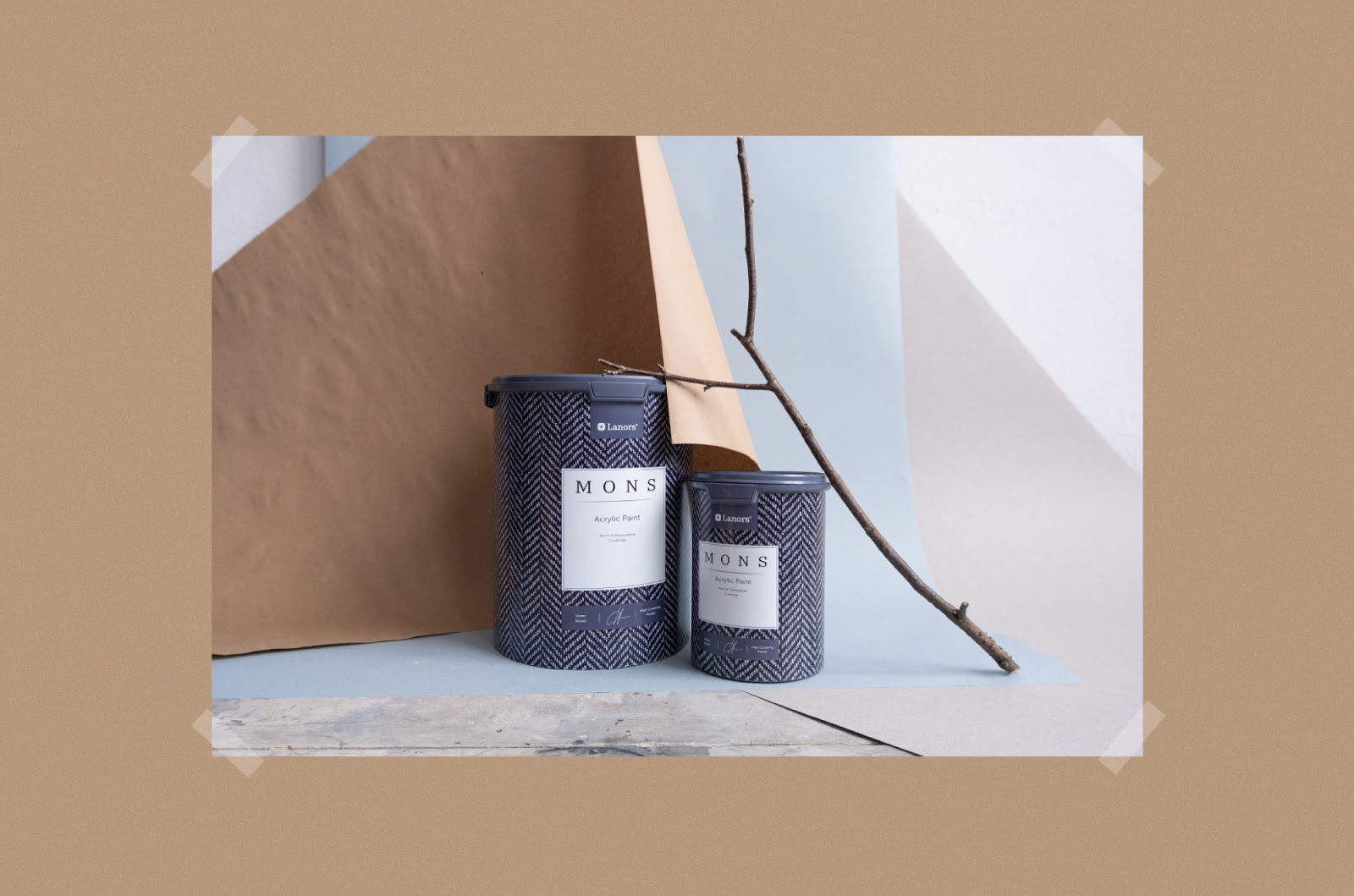
The main unique solution was to place a label with a name on the background of velvet tissue to create a direct association with tactile sensations of touch with it. In this way, the feeling of softness and the texture of the paint are mixed with the visual component of the image. Also this choice of the tissue is defined by the fact that it is associated with density and warmth, which also benefits the perception of the product.
Lanors has been on the market for 10 years and has developed an impeccable color palette within its style and aesthetics. The paints are made in limited batches which makes them exclusive and of high quality. In addition, the colors are collected for each separate client, which is an indication of the company’s individual approach to its customers. The color palette always consists of natural colors, which makes it elegant, universal and at the same time exclusive.
Lanors is highly committed to the European quality and safe materials, which ensures their incredible success in russian market.
Lanors’ concepts of work are perfectly in line with ours, so it is with great pleasure and inspiration that we have implemented the packaging design in a light, minimalist style. The fonts emphasize the minimalist nature of the label, making the name readable and user-friendly.
In general, Mons represents a story about elegance and refined style, which fully corresponds to the conceptual view of UNBLVBL. We learn the needs and desires of the client and put their ideas into practice.