Design: Jose Manuel Vega
Location: Spain
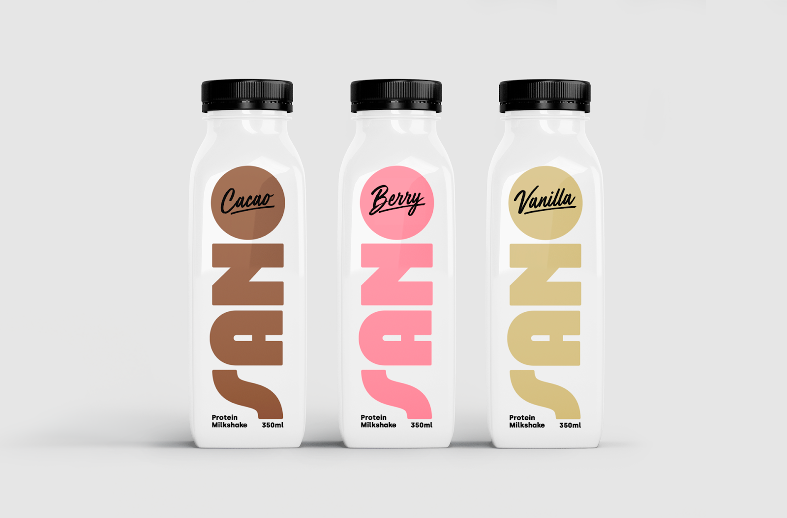
Project Type: Concept
Packaging Contents: Protein Milkshakes
Packaging Substrate / Materials: Plastic
Sano is a personal project for a non-existing brand that produces protein milkshakes. The brand visual identity has been designed following a minimal and clean approach in order to stand out in the selling places among other related products. Sano aims to appeal to young women that are into sports and have a healthy lifestyle. A custom logotype has been created with circular shapes and rounded edges in order to be friendly and approachable. The color palette uses pastel shades of pink, brown and beige to represent each one of the flavors of the brand (berry, cacao and vanilla) and a neutral white to give a clean and healthy look to the product.