Agency: Amoth Studio
Art director: Sasha Sharavarau
Designer: Sasha Sharavarau
Illustrator: Tania Sharavarava
Art worker: Robert Špecián
Photography: Jose Sabino
Location: Czech Republic
Project Type: Produced
Client: St.Nicolaus Trade
Product Launch Location: Slovakia
Packaging Contents: Alcohol
Packaging Substrate / Materials: Glass bottle, cardboard box
Printing Process: Offset printing
Goal:
To develop the label design for a line of medium-segment fruit distillates from a Slovak producer, ST. NICOLAUS.Design tasks:
- To create a unique and pronounced character and mood for the brand.
- To make the product distinguishable from its competitors.
- To attract attention to the product and facilitate a dialogue between the brand and the consumers.
- To preserve and convey Slovak culture and traditions.
Solution:
Having analyzed the competing products in the segment, we discovered that most of the producers prefer visual solutions that have become classical for this type of product: a combination of typography and an illustration portraying the main ingredient of the distillate.To distinguish the new product from its competitors and ignite the interest of the consumers, we decided to take a different approach and created a story around the name of the brand – “Zbojnícka”, which means “belonging to a Zbojník”.

History:
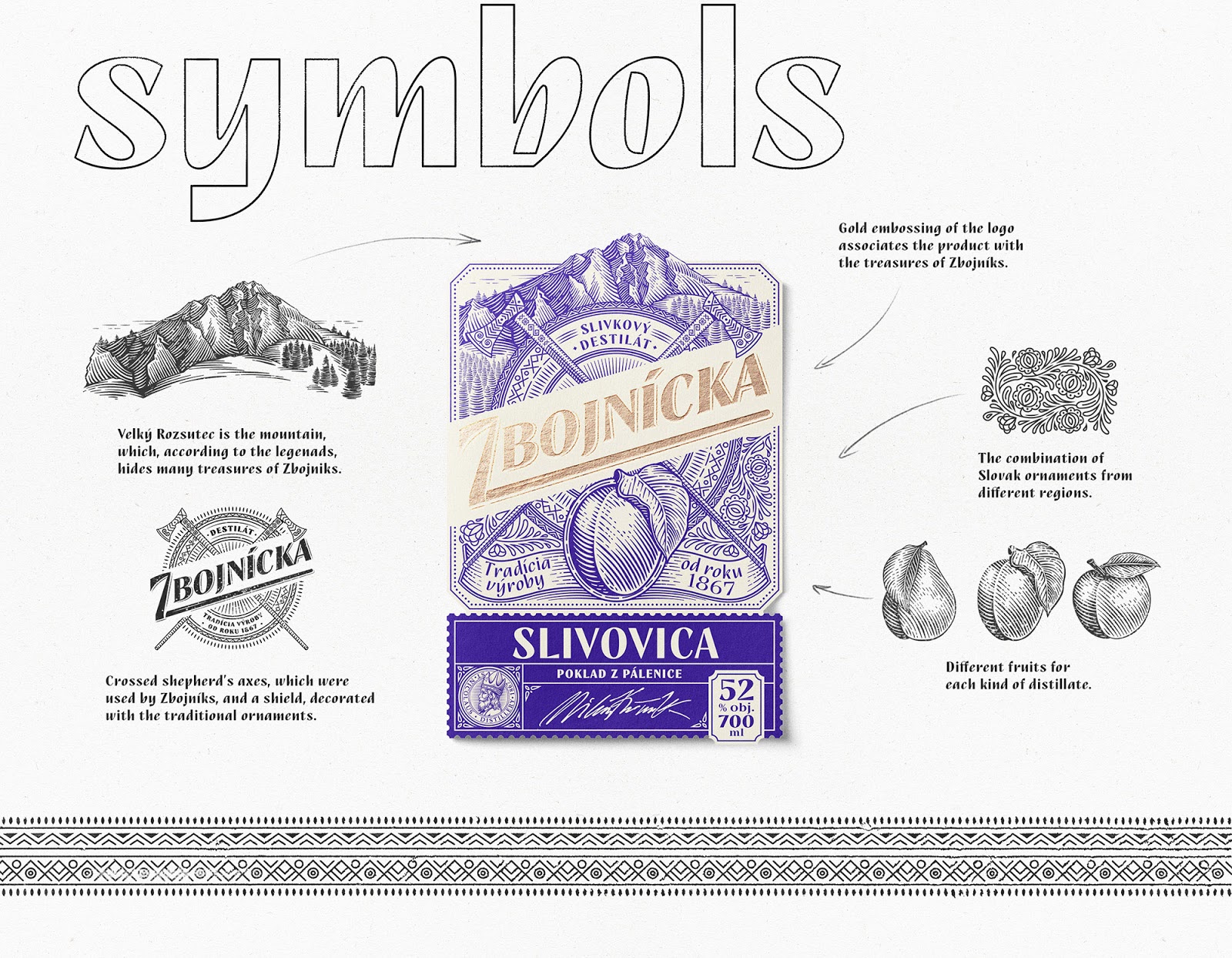
“Zbojníks” was the name given to robbers, who participated in popular insurgencies against serfdom and the tyranny of wealthy landowners. These proud and freedom-loving folk heroes are, in a way, the Slovak Robin Hoods of the Middle Ages. Stories have it that Zbojníks were active in the region of the Slovak mountain range Mala Fatra and that the slopes of the mountains are strewn with their secret paths. People believed that Zbojníks have hidden numerous treasures on Velký Rozsutec mountain (the most beautiful and famous mountain in the region). Many set out to search for these treasures, but no one was able to find them.Traditionally, it is assumed that Zbojníks were hiding the gold stolen from the feudal lords in the mountains. But what else could be valuable for the mighty robbers? A good drink, of course, which is often valued more than any gold.
This idea became a starting point for our label creation. Zbojnícka distillates are the true treasure of Zbojníks. Each element of the label has its significance and tells unique stories from Slovak folklore.

Design solution:
We chose matte crème paper with a soft texture, to evoke the feel of a natural and home-made product. The engraving-stylized illustrations create an impression of being transported into the past. The combination of Slovak ornaments from different regions enhances the image of a truly local, traditional product. Crossed shepherd’s axes, which were used by Zbojníks, and a shield, decorated with the ornaments traditional for the Mala Fatra region are placed in the center of the label.Together, they symbolize traits characteristic of Zbojníks – their warlike nature, readiness to fight and protect their treasures. The top part of the label is dominated by the engraving illustration of the famous Velký Rozsutec mountain, which, according to the legends, hides many treasures. The label is created in two colors, with only the name of the product, “Zbojnícka”, differing in terms of its colour and the printing technique. For it, we used gold embossing, which further associates the product with the treasures of Zbojníks.
The final product was well-received by the target audience and quickly gained a stable position in the market. We were thus able to create a design that stands out on the store shelves and is easily distinguishable from its competitors.