

Design: EMME
Location: United Kingdom
Project Type: Produced
Client: Thirsty Fox Cider
Product Launch Location: India
Packaging Contents: Small Batch Craft Cider
Packaging Substrate / Materials: Glass bottle
The brand
We are here today because we love a good tasty cider and we’d like to share it with you. Founded on the ethos that anything worth doing is worth doing well, the idea of Thirsty Fox was born in Somerville, Massachusetts and raised in India.All our ciders are handcrafted using single origin apples and custom botanicals sourced from family owned farms in America. We set up a simple test for ourselves that we should be able to consume and proudly share the products we make with our closest friends and family. We will be introducing India’s first craft cider, produced and bottled in Nasik, Maharashtra (Mumbai region).
Context and challenge
Keeping in line with a global alcohol trends, the affluent Indians are looking for superior quality products with craft and natural credentials.The market is currently saturated with mainstream and premium beers that are highly undifferentiated, both in terms of packaging and communication.
Being the first home-grown cider in India, our challenge was to set up a whole new grammar for the category and meaningfully differentiate ourselves from current brand of beers and wines. And also be distinct from any new ciders that would launch in the future. Our packaging sets us up well to be the gateway to the category and help grow both ciders and Thirsty Fox simultaneously

Solution
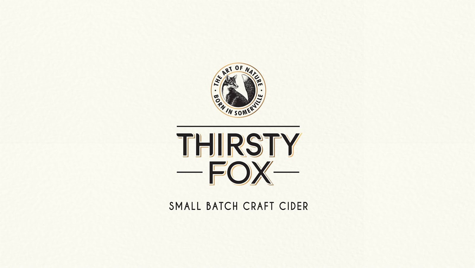
Our brand name, Thirsty Fox evokes the rich folklore around foxes stealing the best apples from the orchards. Our variant names, Izzy, Reed and Kipp are simple, endearing nick names that convey a brand world of inclusivity, simplicity and casual elegance.Our logo is a hand-drawn fox, housed in a gold medallion highlighting the provenance story and brand ethos ‘Born in Somerville’ ‘The Art of Nature’. Our bottle is a 330 ml stubby, with an easy to grip, unisex appeal conveys easy sociability
Our label structure is a full bottle wrap and invites the consumer to indulge in the brand and product story, different from a traditional front and back label approach followed by others. Our label graphics are hand illustrated apples and foliage in full, in a simple structure that helps differentiate the variants by the colour of the apples
The various packaging elements of small batch, hand crafted, all natural and analogous rally up to convey a single expressions – The Art of Nature.

Creating a distinctive look for a premium craft beverage
According to Trillium Beverages, making the right decisions on a distinct bottle and label style was important when creating the product.“For Thirsty Fox, we wanted a label design that would convey the super-premium credentials and the elements of craft and texture. A design that would help us set a whole new grammar for the category in India and underscore the values of a natural, easy-drinking and delicious product”.
To turn this vision to life, Brand Consultant and Art Director Marco Loschiavo Pellicano from EMME joined the project to bring this vision into reality. Marco, together with his team of world-acclaimed designers, started by creating a botanical illustration for the labels. They drew inspiration from the concept of ‘The Art of Nature’. An approach that was pioneered by the famous 17th century Belgian painter and botanist, Pierre-Joseph Redouté. EMME also created the logo featuring a fox to match the brand name, the visual identity, the label design including secondary packaging and POS.
What’s Unique?
We are very excited to share our work for India’s first craft cider, Thirsty Fox.