

Design: Dhwani Mundra, Sneha Agarwal, Sharvari Tambat
Location: India
Project Type: Student Project
School: MIT Institute of Design
Packaging Contents: Detergent, Descaler, Dish washer tablets
Packaging Substrate / Materials: Transparent PET, PP, Glossy sticker paper for label
Printing Process: Digital printing
Our resulting design is the by-product of what we’ve understood is IFB’s brand belief and of the design language that we think goes well with it. We wish to pamper the user’s experience with our graphical and product language just as IFB’s products pampers your laundry and kitchenware.
The design language works in rhythm with the logo. The product language plays on long lines and fillets and a tight wavy body to make it look modern, geometric yet homely. For the detergent bottle, we observed that it didn’t matter what shape the body comes in, users with smaller hands face problems to have a tight grip around the body. Hence, we’ve given a handle that makes it easier for the user to pour from the 1l bottle. For the descaler, we decided to scale down the bottle to continue the same language. For the tablets and pods packaging added a simple snap-style lid which makes it easier for user to open and close. It opens half-way to avoid spillage in case the box drops.
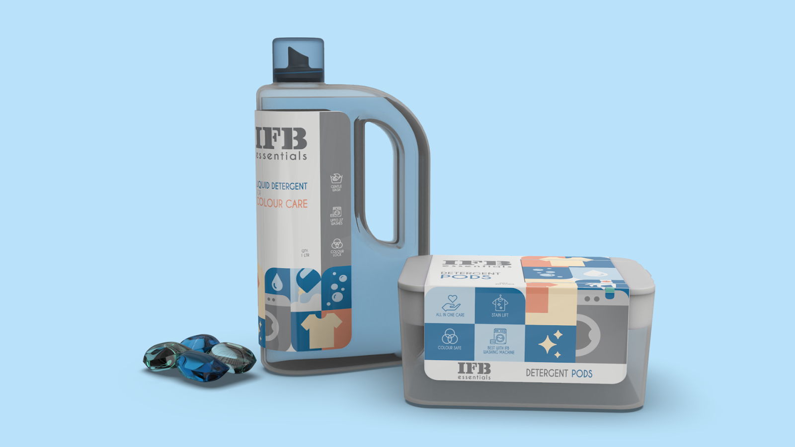
The graphics also play around with clean long lines and fillets. They have a modern, attractive and a friendly/homely vibe. To keep it simple and easy for the users to understand and relate to, they have elements that represent the product’s merits. The graphics placement changes according to the packaging form. The fonts are also kept in balance with the logo and the design language. All these come together to create a strong mental image in the user’s minds.
The colours were chosen after seeing the IFB moodboard and also going back and forth with what we deemed goes well with the product. For the Detergent Bottle- blue as working closely with water and coral as representation of colourful fabrics and Tablets for- green to represent the idea of bio-wash and consumption while honey yellow representing freshness and hygiene. Grey was chosen as universal neutral that is used as the common colour among all 4 products. These eye catchy colours are vibrant hence, help in self-advertising of the brand as it has a colour distinct combination that users will remember. It adds value to the user experience for the product. The contrasting backgrounds on typo and graphics make the IFB logo stand out.

A vibrant and clean label system that makes the brand IFB and its Essentials line stand out while adding value for a positive experience during a rather mundane activity for the users.
The graphics have a modern, attractive and a friendly/homely vibe. To keep it simple and easy for the users to understand and relate to, they have elements that represent the product’s merits.
These eye catchy colours are vibrant hence, help in self-advertising of the brand as it has a colour distinct combination that users will remember. It adds value to the user experience for the product.
The products are built in such a way that they can be reused for other household purposes.


