Design: Natalie Rokosz
Location: United States
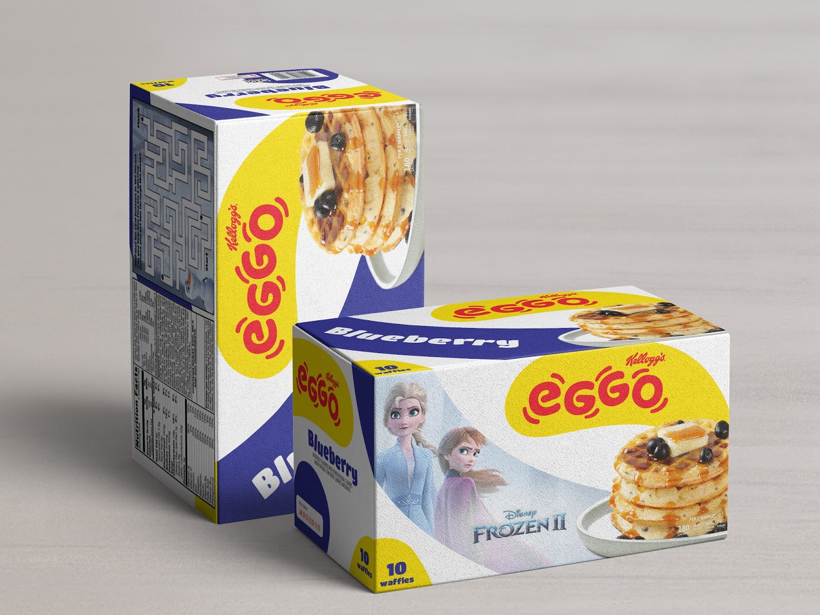
Project Type: Concept
Packaging Contents: Eggo Waffles and Eggo Cereal
Packaging Substrate / Materials: Cardboard
Eggo is a playful and fun brand that strives to create a unique breakfast experience for kids. Promoting ideas and play for children of all ages.
This packaging and identity design was inspired by Eleven’s love for Eggos from the Netflix Original Series, Stranger Things. The letters are treated in an upside down, backwards, rotating treatment. Allowing for a more interchangeable style. The “e” and “g” are the same shape which allows for a rotating and playful experience within the typography. And then I literally just ran with this playful mindset! Envisioning how this would look for this well-known household brand and how one could play with Eggo.
I designed movement lines to encompass the logo which allows the typography to come to life on the packaging. And then, I took these movement lines one step further. By enlarging the shapes, I created a fresh and bold pattern that is truly unique for Eggo and makes it pop off the shelves when compared to their competitors. This modern, playful twist brings a new personality to this well-known brand and brings even more play into this delicious breakfast!