

Design: DS1 branding agency
Location: Russia
Project Type: Concept
Packaging Contents: Ice cream
Packaging Substrate / Materials: Plastic
The packaging design meets the key needs on the basis of which the consumer chooses ice cream
A subsidiary of Valio, the largest producer of milk and food products in Finland, has asked DS1 branding to develop a packaging design for a new line of ice cream. The agency was tasked with identifying the key needs of the target audience and developing a design system that would distinguish the product from a large number of competitors. The DS1 branding team shared the process.
The ice cream market in Russia is highly competitive. There are a lot of world, national and regional brands on the shelves. And the shelf space itself is very limited. According to our data, during the pandemic, sales of ice cream increased by 15%, and its production in the first quarter of 2020 increased by 39.4% compared to the same period in 2019.
The reason for this increase in demand for the product, experts believe the attitude to ice cream as a kind of “antidepressant”, a treat that lifts the mood. In times of crisis, the consumption of ice cream does not decrease, but traditionally increases. The more important it becomes to communicate with the customer using the brand’s design system and linking it to emotional needs.
Paradoxically, despite the saturation of the market, not all market players are distinguished by sufficient differentiating positioning.

According to research, customers often can not decide on the choice of ice cream, even if they came to the store directly for it. According to respondents, very often they do not see the difference between products, can not consider the advantages of one product over another and leave with nothing.
Therefore, we were faced with the task of using the packaging design to convey the key USP, to build up from competitors, to stand out on the shelf among other brands and to create a clear system of communication with the consumer.
The target audience of the product is women 30-50 years old, active residents of megacities, most often-mothers who care about the quality of products. Based on this, one of the subtasks that we faced was to use the design to emphasize the natural composition and taste properties of ice cream.

The Valio team set us the task of developing a design for three packaging formats – sugar tube, popsicle and ice cream briquette, and four flavors – vanilla, chocolate, raspberry and creme brulee.
The visual image of the product was supposed to convey its high quality, differentiate the line from competitors by color, creating a single brand unit on the shelf-Valio. It was also an important task to create a design that meets the global concept of One Valio Design, which unites all the company’s products.
In the process, we have developed 3 packaging design concepts:
- Continuity concept – A concept based on the design of Valio’s existing line of lactose-free ice cream. The main graphic element used in this concept is stripes.
- The Scandinavian concept – The second concept focused on the company’s “roots” and conveyed the idea of a Scandinavian fairy tale and hugge.
- The concept of taste – The third concept, proposed by us and as a result chosen as the final one — is a concept focused on the taste sensations of the product. We conducted extensive analysis and found out that the most important thing for the consumer is the taste of ice cream, its consistency and composition.
Therefore, in the third concept, we made a bet on the formation of consumer values based on feelings and emotions. As the main graphic element, we chose soft strips that are subconsciously associated with melting, tender and soft ice cream. For each taste, the corresponding colors of the stripes were used.

“One of our sub-tasks was to introduce a food zone that would make you want to try this product. We decided to arrange the food so that it was on the strips of its color and seemed to “stretch” over the entire package. This makes it easier to communicate with the customer – it becomes easier for them to see and understand from afar the taste of this ice cream,” – Svetlana Klupinska, CEO of DS1 branding.
We also paid special attention to the brands that convey the quality of the product. Recently, there has been a dynamic growth in the trend for products with a high fat content. People are aware of the importance of fat for the health and full functioning of the body. Therefore, when setting the task, the Valio team made a separate emphasis on the selection of the ice cream category – “ice cream”, which corresponds to this trend and the traditional love of Russians for high-fat ice cream.
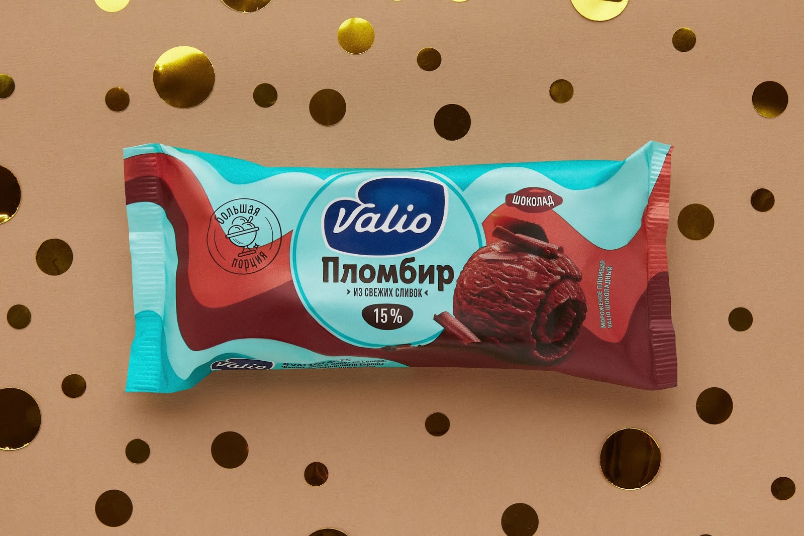
Given the target audience of the product, which attaches great importance to the quality of the product, with the help of brands located in the center of the package, we designated the increased fat content of the product-15% and its composition- “from natural cream”.
Also on the packaging are interesting facts about ice cream, related to the roots of the company Valio. On a chocolate sundae, for example, there is information that despite the fact that Finns live in the north, they are still considered champions in the consumption of ice cream. This method of communication is not used by any of the players in this segment.

“Valio has already been represented in the ice cream category, but in a narrower segment – cream ice cream without lactose in buckets. We were faced with the task of entering the segment of portion ice cream that is more familiar to consumers. This is a very rich category with local players and the main goal that we set for ourselves and the agency is to stand out from the general mass and create a visual brand block on the shelf space.
At the same time, an important task was to preserve the continuity of all the values of the Valio brand. When working on the task, the creative agency demonstrated a deep analysis of the category and an understanding of the target audience, as well as interesting and non-standard solutions. For us, this was the decisive factor in choosing a partner. This is not Valio’s first collaboration with the DS1 agency. In the process of working on the project, I think we have a great tandem, when a good result is achieved in dialogue and the ability to hear each other.
We are completely satisfied with the result of our work on the project and are confident that our customers will also appreciate not only the taste and quality of the new ice cream, but also get aesthetic pleasure from the packaging of this product! ” – Anna Orekhova, brand manager of Valio.


