
Agency: Unified Brands
Creative Director: Alex Butenko
Design Director: Melissa Doria
Location: New Zealand
Project Type: Produced
Client: Dominate
Product Launch Location: Global
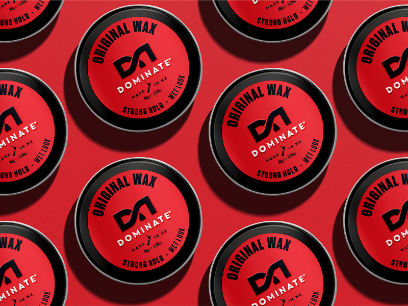
Packaging Contents: Hair styling products
Packaging Substrate / Materials: Metal tin
Printing Process: Flexo
Here was a successful men’s hairstyling brand; one of the largest in New Zealand and Australia ranged in over 2,000 stores. However, the brand had little focus or investment over the past six years and as such had fallen into decline.
During that time, the category went through significant change with the explosive trend of barbershops (and barbershop hairstyles); shifting consumer behaviour, and seeing many shoppers move away from mainstream supermarket retailers. This brought a wave of new supermarket competitors which directly played to this trend, gaining a significant amount of market share. We needed to halt the decline and ultimately take back the leadership position in both markets.
In the 20 years since Dominate launched, the definition of masculinity had undergone huge cultural shifts. And for a brand that played heavily on a very old-school ‘strong hold’ masculine positioning, we needed to look at how we reflected a more relevant and modern expression of what masculinity means for people today – without becoming another me-too barber style brand.
Power and dominance, once pillars for the brand, were now seen negatively. The new perspective for masculinity is more dynamic; engaging and smarter, more empathetic and self-aware. Tapping into this sentiment we were able to bring about significant change for Dominate without walking away from the true essence of the brand. Small but meaningful strategic shifts at the heart of the brand; from forceful and powerful to strong – taking a negative expression of male strength to a positive one.
From here we were able to develop an exciting new ‘Hold Strong’ platform for the brand which celebrates healthy masculinity and building inner strength and unlocking a fresh visual expression for the brand. We re-crafted Dominate’s D8 symbol, to become a strong and dynamic new signpost for the brand. Then paired this with a wordmark that broke the norms of stereotypically masculine typography, instead, giving it confidence through bold geometric sans serif and gravitas through increased letter-spacing. Evolving the brand mark to a more considered and dynamic expression helped us declutter the brand’s visual language; giving us breathing room to really dial up New Zealand provenance, craft, and quality perceptions.
What’s Unique?
The result is a new bold and expressive identity and positioning that’s given the brand meaning once again, and with that reignited passion within the business, turning around large key retailers.


