
Design: M&A CREATIVE AGENCY
Location: Portugal
Project Type: Produced
Client: AdegaMãe Atlantic Wines
Product Launch Location: Global
Packaging Contents: Wine
Packaging Substrate / Materials: Glass Bottle, Cork, Label, Capsule
Printing Process: Offset Printing, Digital Printing, Foil Stamping
The Challenge:
Our customer selected the agency for a pitch, which was to understand the brand DNA and history, to define a new communication strategy, product positioning as well rebranding and advertising campaign on and offline.The Project:
After one month work and study our creative teams have reached to a solid idea. We decided to change the bottle and create a whole new light, clean and sexy packaging design, as well the full advertising campaign with a very inspiring storytelling, photography, video, social content, collateral materials, etc.. The message was clear: We want people closer to the brand in a very emotional sense and experience, saying loud and clear the claim: “I DorYou”Why Dory?
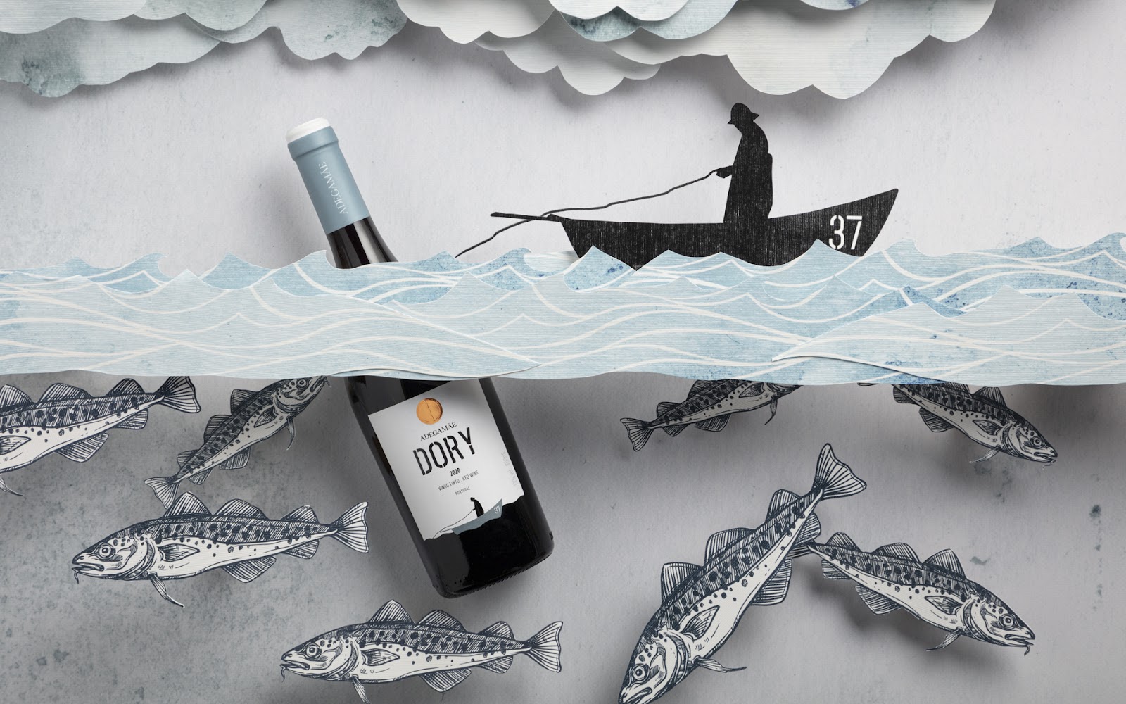
Inspired in the name of Dory and his history, a small flat-bottomed boat, used by brave Portuguese fishermen, in cod fishing, one of the most difficult and risky ever, with journeys of several hours of heavy work, in areas frequently affected by maritime weather. Navigating a Dory was an art.What’s Unique?
This project allow us to start from scratch in many different areas, from strategy, copy and storytelling, design, social media, photography, video, RP and launch event. We definitely had the opportunity to test our in-house 360º communication ecosystem putting all the teams working together.


