Design: Isaac Fusté
Location: Spain
Project Type: Concept
Packaging Contents: Extra virgin Olive oil
Packaging Substrate / Materials: Glass bottle, Box paper
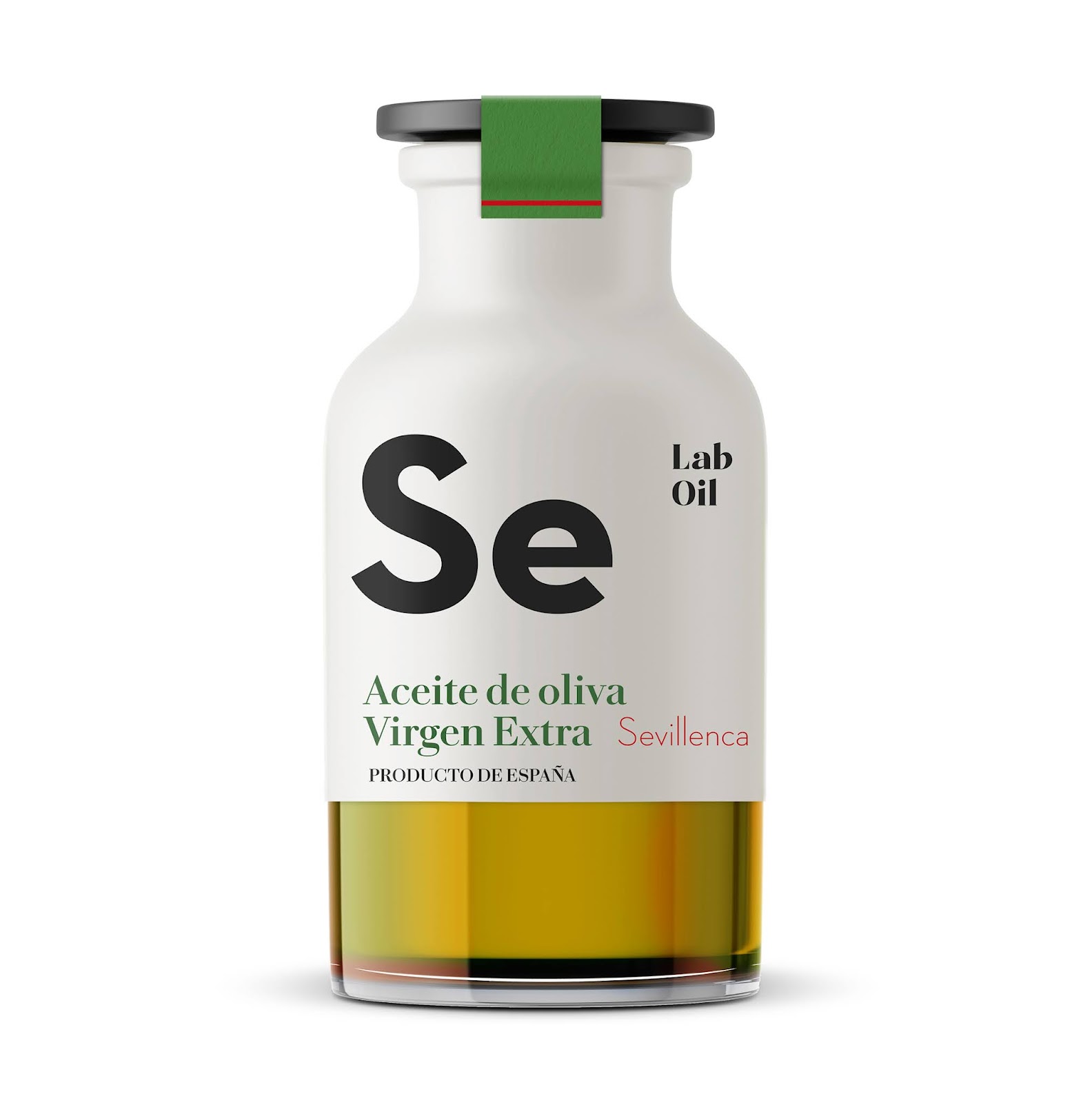
LabOil, is a new brand of extra virgin olive oil. For this project, different designs have been made for the typical Spanish olive oil varieties, such as: Morruda, Arbequina, Sevillenca and Picual.
With the initials of each variety, an identifying design has been created for each extra virgin olive oil, recalling the design of the periodic table of elements, (Ar, Mo, Se, Pi) this can help the consumer / client to find it more easily the type of extra virgin olive oil you want, since the initials are in large size.
The color of the bottles is white, to stand out more from the rest of the competition, and with the black typeface there is more visual contrast. At the bottom of the bottle you can see the inside of the bottle, thus exposing the color of the extra virgin olive oil.
Each variety of olive oil is assigned a color: blue, yellow, red and magenta, to further differentiate each variety of olive, the color is a small visual point of graphic identity. Each bottle has a black cap, so it stands out more with the white of the bottle. The closure of the bottle consists of a green sticker with a colored line, which varies in each variety of olive.
It was decided to make a format for the 250ml bottle, allowing the consumer to buy the four varieties and taste all the extra virgin olive oils, made in Spain.
The project consisted of developing the packaging design for the four extra virgin olive oil bottles, choosing the type of glass bottle and creating the branding of a new visual identity for this company.