Agency: Norlo Design
Art Director: Anna Long
Location: United States
Project Type: Produced
Client: Copper Kettle Brewing Company
Product Launch Location: United States
Packaging Contents: Beer, Alcohol
Packaging Substrate / Materials: Glass bottle, Paper Label
Printing Process: Foil Stamping, Digital Printing
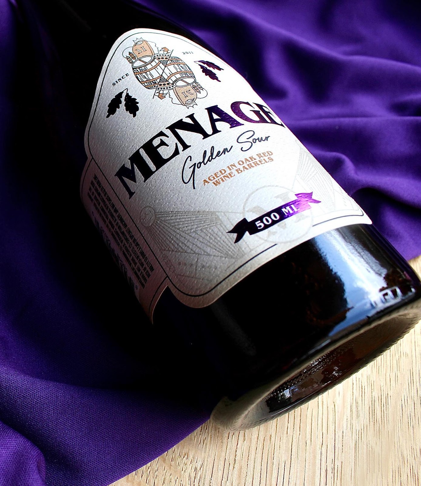
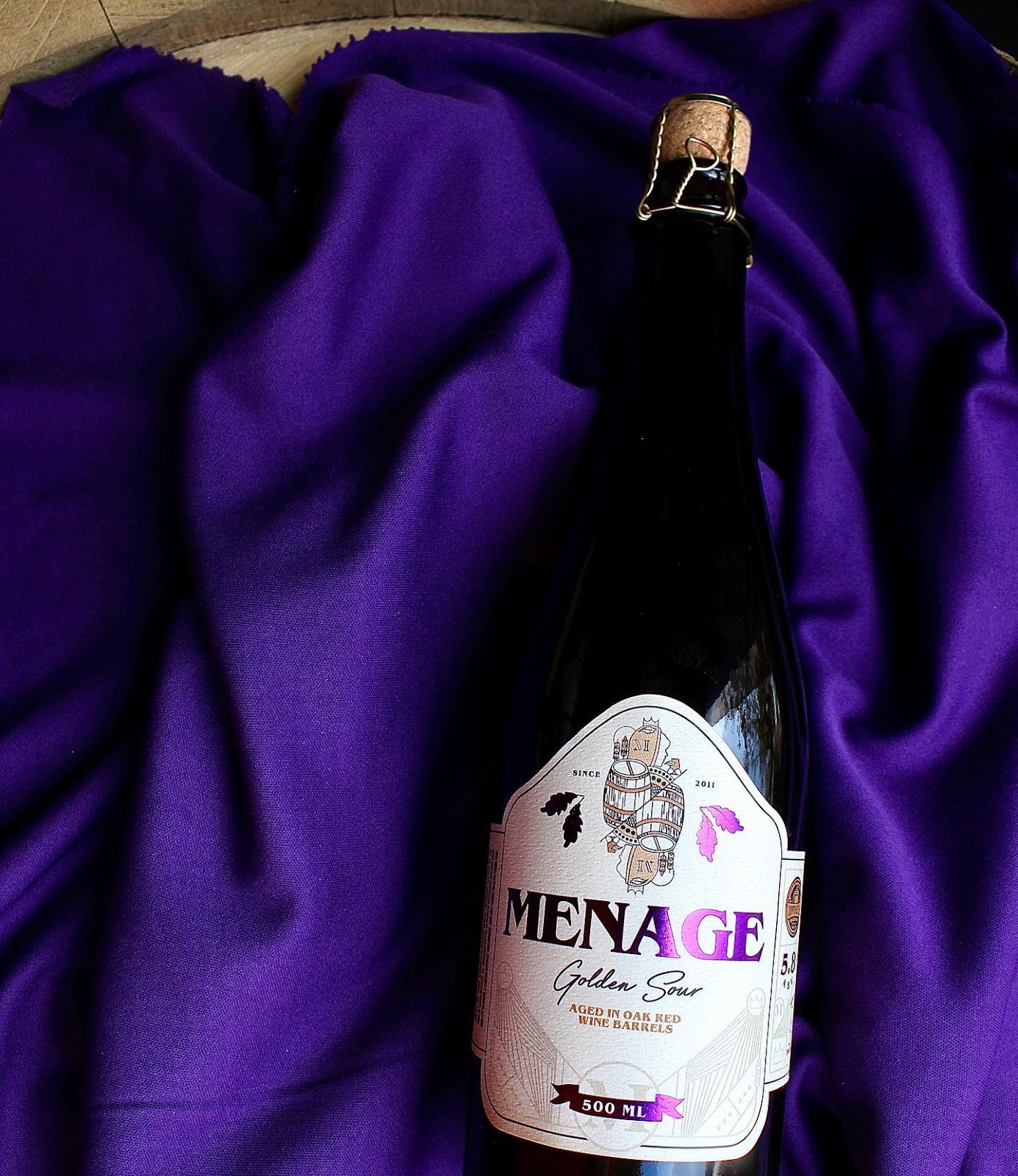
This golden sour was originally called Ménage à Quatre, a nod to the four microorganisms that make it sour during the brewing process. It was later shortened to Menage; a name that dances on the tongue as easily as the beer itself does. Inspired by the French name and unique aging process, we knew we wanted an elevated and timeless label.
Aged in oak red wine barrels, this sour had never been bottled before and is the only bottle of this kind in Copper Kettle’s lineup. For a label deserving of that pedestal, it needed regal elegance. Art Director, Anna Long, created a custom dieline for this label that accents the shape and curve of the 500 mL glass bottle. Rounded corners feel natural on the eye while the shape of the label’s front panel mimic the curve of the dark glass while suggesting a family crest like contour.
A queen is portrayed front and center displaying herself like a playing card while being interlaced with wood barrels, oak leaves, and wheat stalks to flaunt the unique and intricate qualities of this high-end beer. The label is printed on thick, textured cream paper with the edges browned, leaning into the story of vintage regency and the unique aging process.
Deep and striking violet foil dons the name, oak leaves, and the volume ribbon, creating an eye-catching, three-dimensional experience. We chose to carry the intricate line work throughout the label to unify individual elements and lead the consumer’s eye to each section of information. The result: a standout on the shelf that is as regal as its name.
What’s Unique?
The vibrant purple foil that was used by foil stamping was chosen as it is the universal color of royalty, and it is highly reflective and sparkles back at the consumer upon immediate gaze. The paper chosen for this label is thick, textured, and worn looking mimicking a wine label to show just how premium it is. The label’s side wings are differing in length to give it a unique and asymmetrical shape contrasting the symmetry of the frontal design.